Text decoration
Does anyone knows the logic of text decoration? And no, MDN article didn't help me.
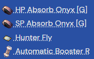
Trying to compare the dots underneath the text. Some look like they have more breathing room than others. Why is that?
I tried messing around with line-height, padding, properties, img vs no img, still the same.
Trying to compare the dots underneath the text. Some look like they have more breathing room than others. Why is that?
I tried messing around with line-height, padding, properties, img vs no img, still the same.

A friendly place for developers to meet other devs, ask questions, get help, and just have a good time 🙂.
36,263Members
Resources
Recent Announcements
Similar Threads
Was this page helpful?