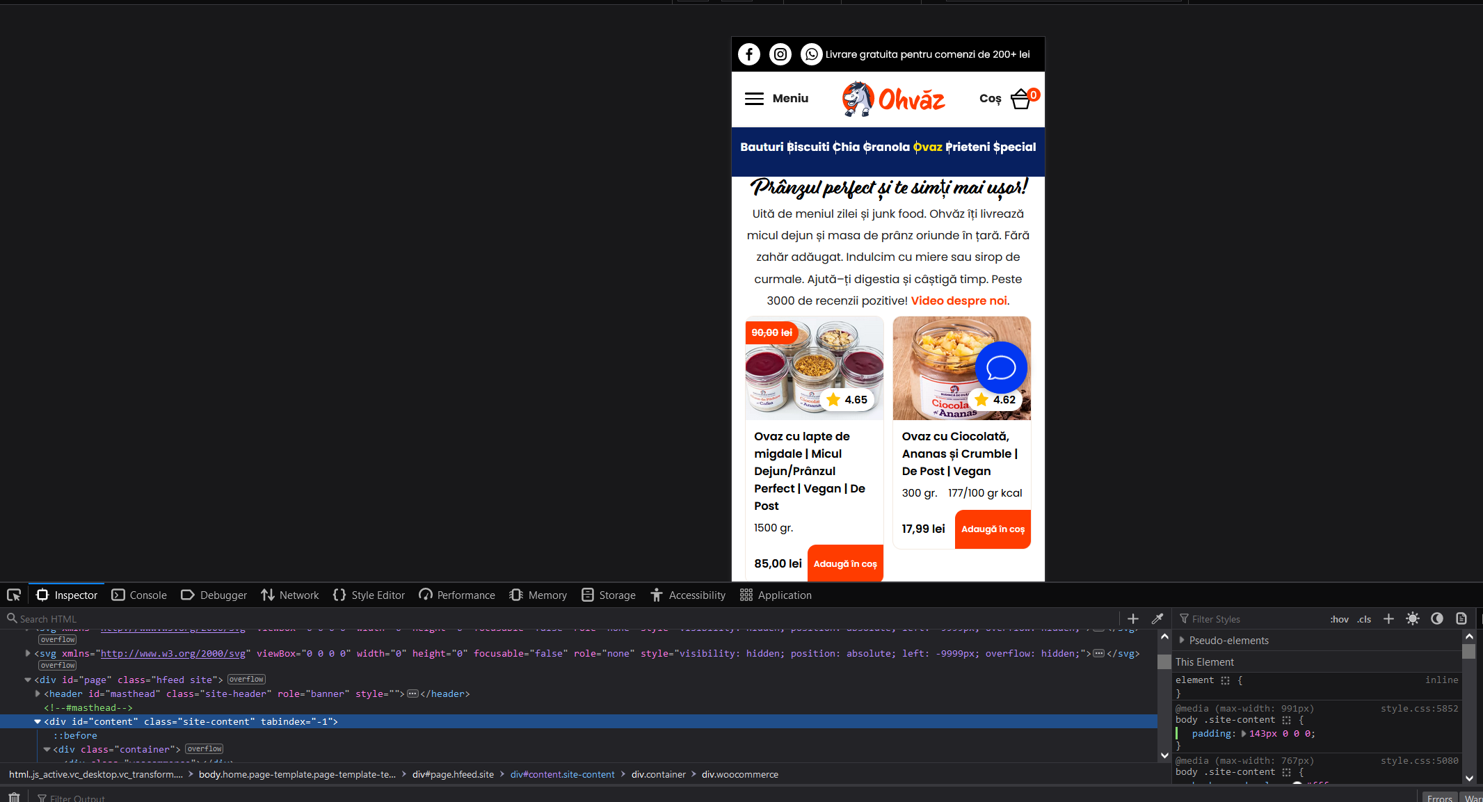
Best practice for setting up spacing?
Hi, I'm a UI designer that's learning a bit of front-end work. On www.ohvaz.ro, the mobile version, there was a huge padding set to 143 px (as shown in the screenshot). This is clashing with some other place so I had to reduce it to 103px but the handwritten headline is being hidden. My question is - does this large padding make sense? For a newbie like me it seems quite odd. If it's not a best practice, how could I achieve the same result without too much work?
2nd question - the | dividers in the blue menu aren't spaced correctly. How can I fix those? Thank you!
2nd question - the | dividers in the blue menu aren't spaced correctly. How can I fix those? Thank you!

