Force Grid Box to align at top
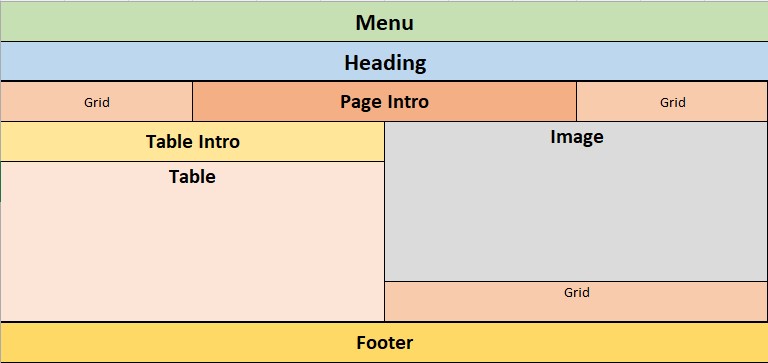
New to Discord so please forgive me if this post is not as it should be. I'm having an issue with content alignment within a grid box. The first image illustrates my desired result of a page using a grid. The Menu, Heading, and Footer are not part of the grid structure. I have 10+ pages that use this same structure. The attached text file is a mixin I use to include the grid structure.
The four parts of the grid can all be of variable height.
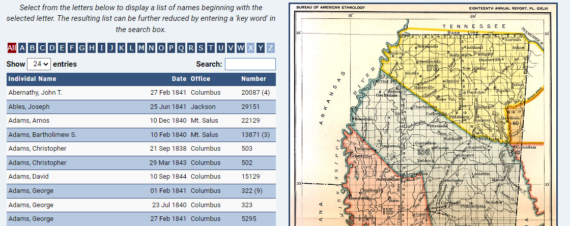
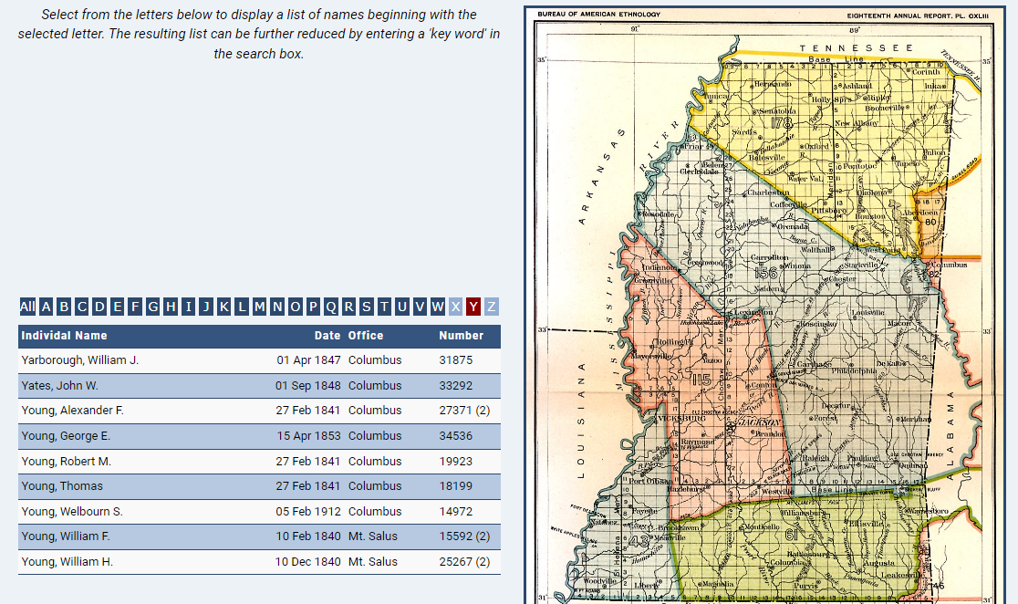
The problem is related to the height of the page_Table area. The area is populated with a dataTable from my database. Because the table length is greater than the height of the image everything looks fine (2nd image, i.e., table aligned to the top of the grid area). But, if one of the alpha letters is selected, which has fewer rows than the base table (3rd image) the table appears in the middle of the grid area.
I can 'force' the table to the top by setting the min-height value for the page_Table area, but this (I would think) would be unnecessary if something else was set properly. My question thus is... what do I need to change in the mixin to ensure that the page_Table area is always aligned to the top, regardless of the content height?
Somehow, the fact that the page_Image area spans 2 rows has some effect on the table. If I move the image down a row with no span, the table aligns to the top at all times. I tried several options for the alignment, but nothing seems to work.
You can see a 'live' illustration of the issue with this 'link' (https: slash slash www dot msholmes dot org/churches).
Once on the page select the letter 'Z' to see the issue.
Any help with this issue is greatly appreciated.


page_Wrapper_Mixin.txt1.13KB
