Looking for feedback on look and feel of a Burger shop's website
Hey! So I've been trying to dedicate some time to actually make some effort into creating website designs. I was planning on redoing a single home-page just to get started and chose this website https://burgerlab.com.pk/ . I looked through it and made a spin on how I can improve some elements such as typography and general flow of the website.
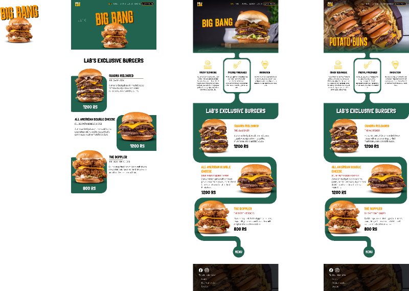
Here's my approach to it: https://www.figma.com/file/bSD7siayQ8Naboed6xMJGA/Untitled?node-id=0%3A1&t=pcRiT8SX3dJQjZbH-1 . It includes my first approach (Left) and my current approach (Middle and Right)
Things I tried to touch on
1. Header is a slideshow which shows all the new items
2. Change the font so it reads better ( I felt that the burger description text was too small and the font choice wasn't the best)
3. Add more contrast
4. Present a "walkway" to showcase the most popular burgers in the store
5. Reworked the navbar
An additional note is that I am guilty of not aligning/sizing things as perfectly as they should be, especially in the areas of the burgers description.
I do want to spend more time on this, since I feel like the homepage doesn't show off too much of what the store is. But I was hoping I could find some errors/improvements in my approach so far that I can tend to before proceeding forward.
Thank you in advance for taking time to look through this

A friendly place for developers to meet other devs, ask questions, get help, and just have a good time 🙂.
36,263Members
Resources
Was this page helpful?