Need Help with Grid
Code Pen:
https://codepen.io/Arslan-Akbar/pen/poOMadb
Images included also with grids
So I'm trying to learn grid by making a small project.
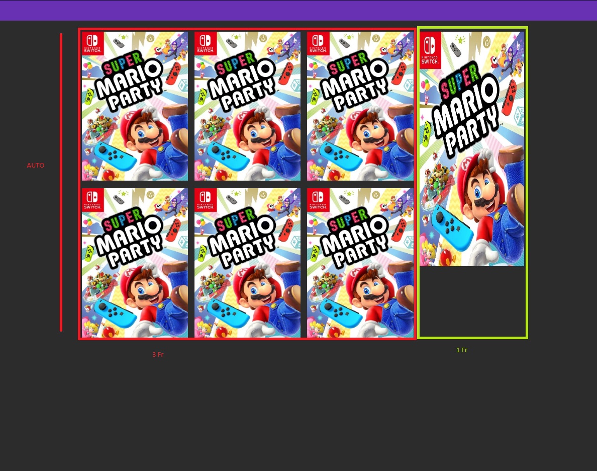
I made 2 column
3 fr (main-content) 1fr (side content)
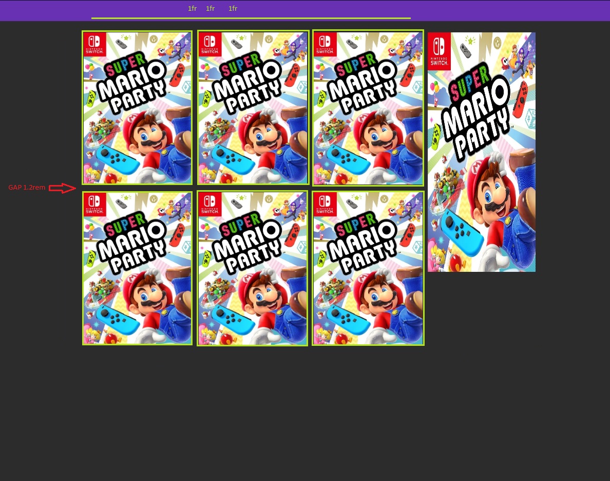
3fr (main-content) contains (gap: 1.2rem)
- games gallery column (using grid) (1fr 1fr 1fr)
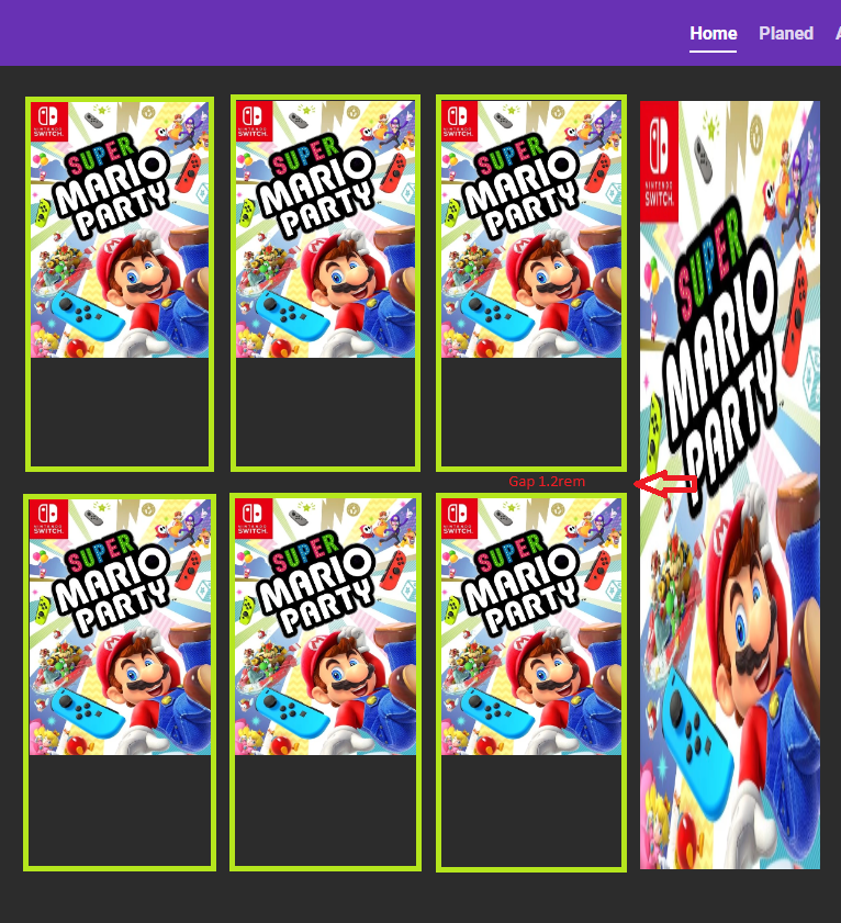
1fr (Side Content)(I have the picture on side to kind of represent something there that exceed the height of left content)
if the side contents height is more than the content on the main-content area. It leaves empty area inside each of the games image inside games galley.
Images below for reference.
Once again I'm new.
Fix I've tried.
using grid-template-rows: auto; does nothing
tried using grid-template-rows: max-content or min-content (both are doing the same thing currently;
but I have to use it as many row I've got. Like if I currently got 2 ROWS. I can use it 2 times or once as empty space is only created below the image. But if in case i add more images, I have to add more rows into grid-template to it every time they increase. Can it not be more automated.


