Feedback on git website redesign typography
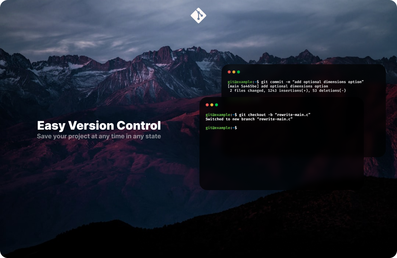
I was pretty proud of this minimal page that I made for a git website redesign, until I created the header, which doesn't seem to fit in with the rest of the page, as it looks relatively small and basic. I would appreciate some feedback on the typography and position/sizing. If the Figma files are required I can send them over.

A friendly place for developers to meet other devs, ask questions, get help, and just have a good time 🙂.
36,263Members
Resources
Recent Announcements
Similar Threads
Was this page helpful?