Accessibility and Colors
Hi, in my company we are creating websites and require pass AA of Accessibility.
I'm learning everything about that but I have some doubts. If I try to use nice colors for my background or text, doesn't pass accessibility and If I try to modify looks like this (very ugly)
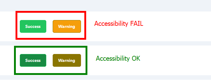
For example my "warning" or "success" color that I attached to this post. The "warning" passed accessibility with 4.52 (from 4.50 is OK to pass).
I see a lot of websites that doesn't pass accessibility colors and very big companies too and I don't know if it's really very important or not.
It's very frustrated because I feel my designs are very ugly.
I'm doing something wrong?
Any idea?
Thanks!!
I'm learning everything about that but I have some doubts. If I try to use nice colors for my background or text, doesn't pass accessibility and If I try to modify looks like this (very ugly)
For example my "warning" or "success" color that I attached to this post. The "warning" passed accessibility with 4.52 (from 4.50 is OK to pass).
I see a lot of websites that doesn't pass accessibility colors and very big companies too and I don't know if it's really very important or not.
It's very frustrated because I feel my designs are very ugly.
I'm doing something wrong?
Any idea?
Thanks!!

A friendly place for developers to meet other devs, ask questions, get help, and just have a good time 🙂.
36,263Members
Resources
Recent Announcements
Similar Threads
Was this page helpful?