feedback on logo proposals I received?
contacted a logo guy to make some logos for me since I am not great with logos or iconography and got a few submissions, of the submissions there were 4 I sort of liked and wanted to get eyes on these and determine which style may be the best to work with and keep refining with the logo guy.
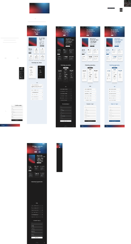
informed the designer I'm looking for a modern / cutting font with a geometric approach to the logo around the name Tristar.
https://www.figma.com/design/5WUXfdbMRtWWqCMYEaoG2n/web_agency_branding?node-id=0%3A1&t=At9VKsjR6p6hcEaT-1
I like the top left logo minus the gray, working on a smoother third color to work with if you all have any suggestions please let me know.
I like the pop of the top right one but the wordmark would need to be changed to match light mode / dark mode which I'm not entirely a fan of but I do like the logo design a little too
Bottom left is fun but I feel like the logo itself doesn't work well without the word mark.
I like the bottom right as well because the font is sharp and the logo can work on it's own without the word mark more than the bottom left but I am wondering about the font weight and if it's too heavy

A friendly place for developers to meet other devs, ask questions, get help, and just have a good time 🙂.
36,263Members
Resources
Similar Threads
Was this page helpful?