need help in grid and flex css in responsive
Codepen :
https://codepen.io/Vicky-clowdy/pen/Bagejre
So it wil be like :
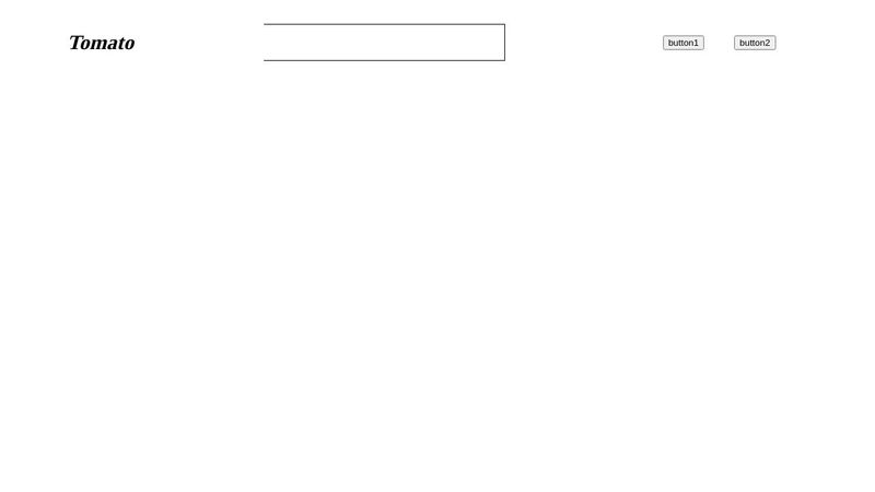
Tomato input box button1 button2
But now in resposnive i want it to like this :
Tomato button1 button2
input box
the buttons goes beyond that 100% width
https://codepen.io/Vicky-clowdy/pen/Bagejre
So it wil be like :
Tomato input box button1 button2
But now in resposnive i want it to like this :
Tomato button1 button2
input box
the buttons goes beyond that 100% width

A friendly place for developers to meet other devs, ask questions, get help, and just have a good time 🙂.
36,263Members
Resources
Was this page helpful?