Responsive Hero Section
Hello everyone, I hope you can understand my English as it is not my first language.
So the thing is I am trying to create a hero section on my portfolio practice. I created a <div> container called hero
inside this container has a <div> that has a class of left inside it has h2 and a p element
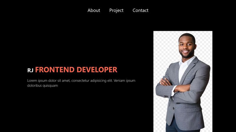
and for the right side is only image
I want to achieve responsive hero the thing is that the image on right is overlapping when I am on smaller screens
refer to the first I uses Pesticide plug in on my browser to see the overlapping image it overlaps to the container no mater what i do even tho i set it to percentage size
I already created a lot of media queries to set the size of image to lesser percentage but it looks ugly, Is there any other way?
the other problems I encounter is on smaller screen, the image wont stay on the bottom of my container refer to the image. I want this image to always on the bottom i don't know why does it go up even though i set up justify content space between on my flex
please refer to this code
The image I use in this codepen is just example image please don't bother about the image and I hope you guys can understand what I am saying
https://codepen.io/Jenzel-Delavictoria/pen/EaYPwYY
So the thing is I am trying to create a hero section on my portfolio practice. I created a <div> container called hero
inside this container has a <div> that has a class of left inside it has h2 and a p element
and for the right side is only image
I want to achieve responsive hero the thing is that the image on right is overlapping when I am on smaller screens
refer to the first I uses Pesticide plug in on my browser to see the overlapping image it overlaps to the container no mater what i do even tho i set it to percentage size
I already created a lot of media queries to set the size of image to lesser percentage but it looks ugly, Is there any other way?
the other problems I encounter is on smaller screen, the image wont stay on the bottom of my container refer to the image. I want this image to always on the bottom i don't know why does it go up even though i set up justify content space between on my flex
please refer to this code
The image I use in this codepen is just example image please don't bother about the image and I hope you guys can understand what I am saying
https://codepen.io/Jenzel-Delavictoria/pen/EaYPwYY


A friendly place for developers to meet other devs, ask questions, get help, and just have a good time 🙂.
36,263Members
Resources
Was this page helpful?