Feedback on Mobile View of New Effect Docs
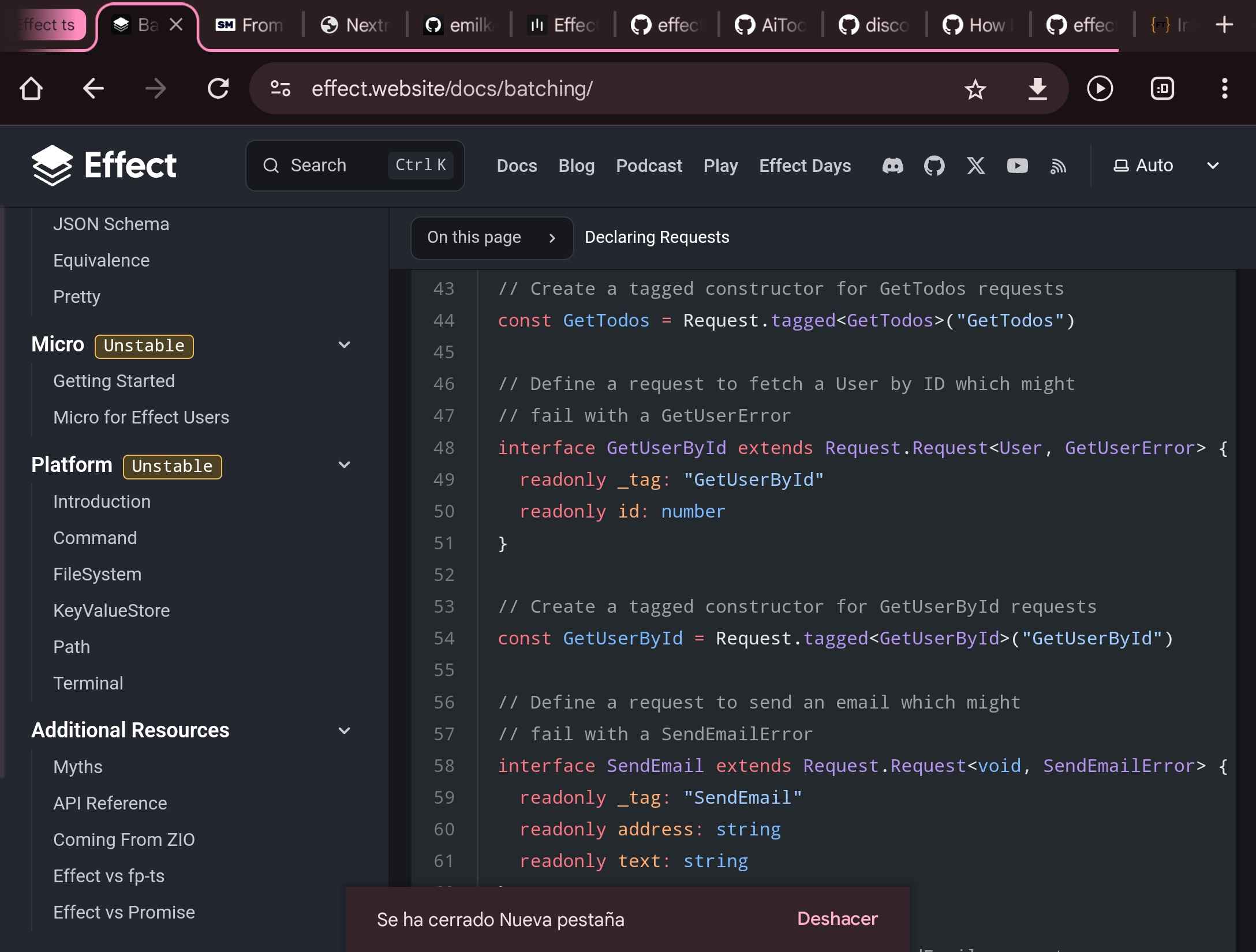
The new effect docs are amazing. I love the code folding and the hability to see the types directly in the docs. I often check them from my mobile phone, which is a bit wider than normal phones . This seems to trigger a style query optimized for desktops, which is not very useful in my phone. It looks like 70% content and 30% navigation bar, which is too narrow to properly read the page. It will be awesome if you can adjust it to treat to work like in any other mobile device, or an option to manually collapse the sidebar. Here is a screenshot of how it looks

