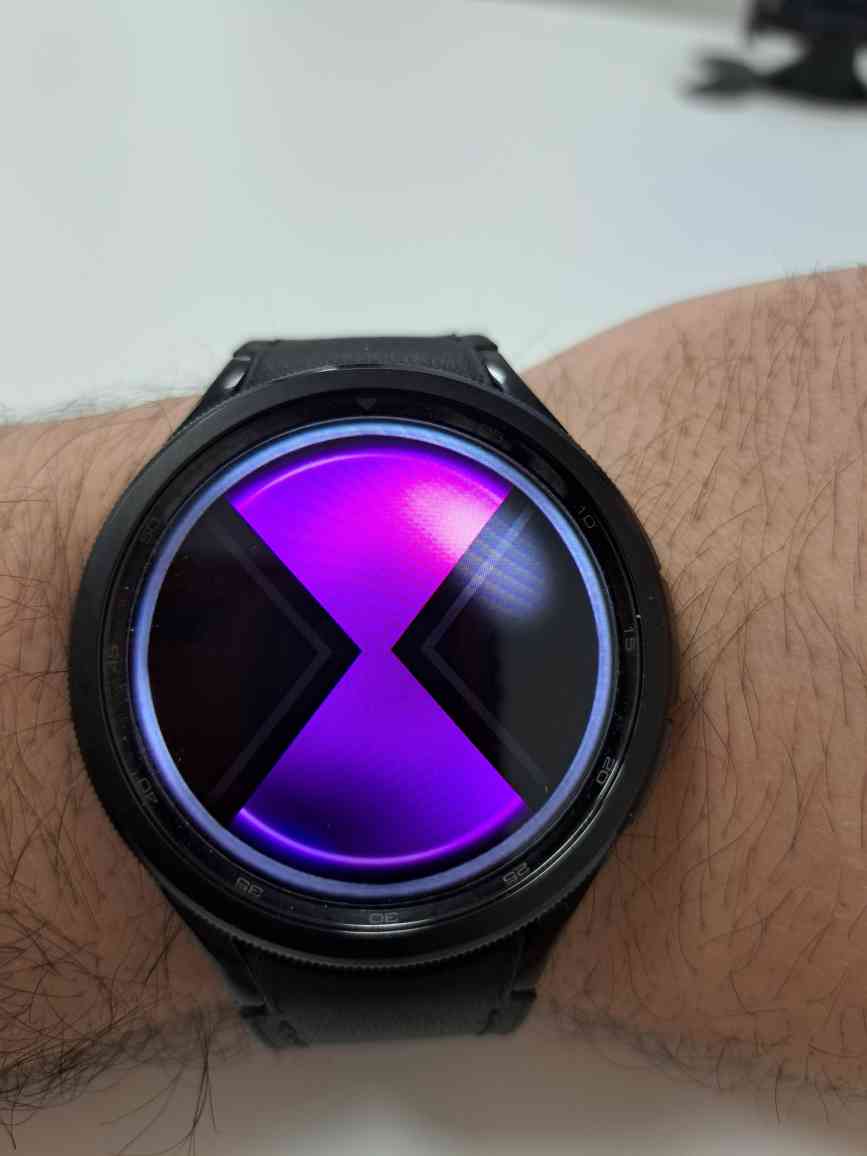
Difference in color
I don't know if it's just me or if it's supposed to be like that, but it seems like the color scheme is very different, when locked it seems closer to pink, and the second option looks really cool.
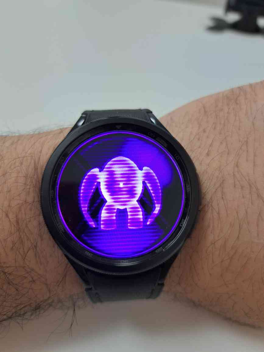
for comparison I also made a blue color
It's not like I'm being picky, everything is fine, I just became curious, maybe I'm not the only one who noticed such a slight difference or maybe I'm just going crazy)
9 Replies
by the way, I also noticed an incorrect transition in blue here, I noticed it completely by accident
but this wasn't the case here, it's strange why that is 🤔
In my experience, this kind of spot only appears with blue color
Yh even on the os omnitrix when using those bright colours like blue, when in timeout the pixels looks super compressed and hyper saturated
Will this be fixed somehow? Are you not aware?
if a team member sees this soon
in standby mode:Proud:
Sizon actually needs to see this
We found a eon