<DockPanel>
<Menu DockPanel.Dock="Top"
Background="#2C2C2C"
Foreground="White"
BorderBrush="#404040"
BorderThickness="0,0,0,1" Height="25">
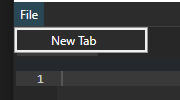
<MenuItem Header="File" Height="25">
<MenuItem Header="New Tab" Click="NewTab_Click"/>
</MenuItem>
</Menu>
<TabControl x:Name="EditorTabs" Background="#272727" BorderThickness="0"/>
</DockPanel>
<DockPanel>
    <Menu DockPanel.Dock="Top"
          Background="#2C2C2C"
          Foreground="White"
          BorderBrush="#404040"
          BorderThickness="0,0,0,1" Height="25">
        <MenuItem Header="File" Height="25">
            <MenuItem Header="New Tab" Click="NewTab_Click"/>
        </MenuItem>
    </Menu>

    <TabControl x:Name="EditorTabs" Background="#272727" BorderThickness="0"/>
</DockPanel>
