[SOLVED] Can't figure out how to do this layout with css grids and `aspect-square`...
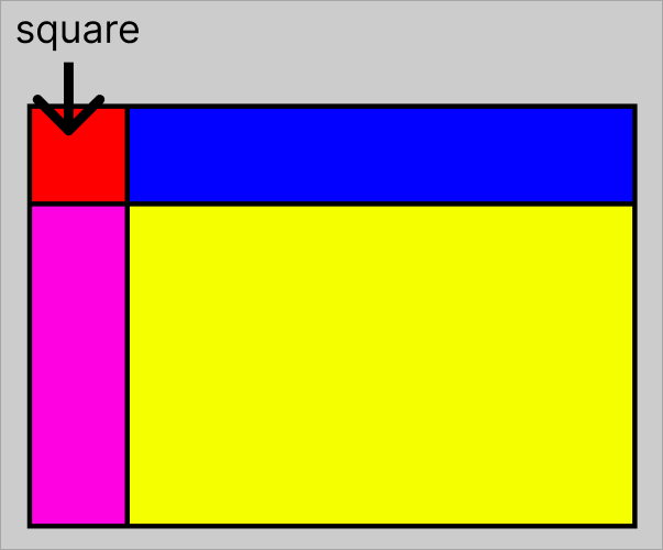
Im trying to make a card with the following layout. the main requirement is that the red box should be a square, with an icon/logo inside. this will be a 2x2 grid.
the red square should have the same height/width as the blue cell's height, so if the blue cell gets bigger, the red square will size accordingly
the pink cell is essentially blank, but will have the same height as the yellow.
the yellow cell height will change dynamically based on the content.
sorry if this is confusing, maybe this will clarify:
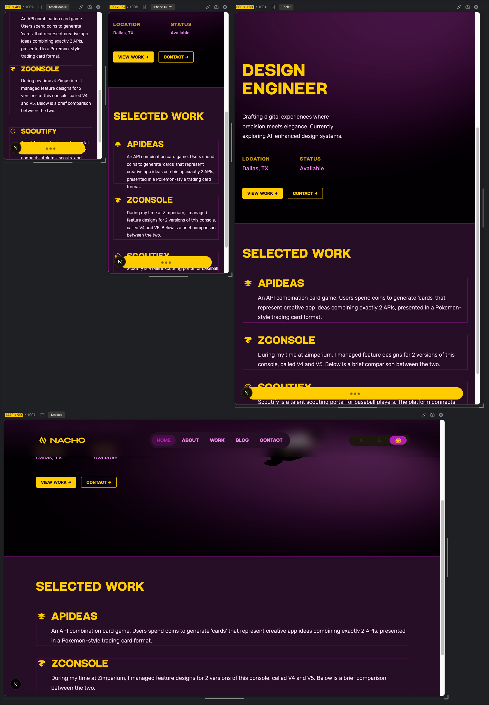
so far, im somewhat able to get it working, but am facing clipping/overlapping issues on smaller devices. AI told me it has something to do with
here is some code: https://pastebin.com/Ba8yc8Ma
the red square should have the same height/width as the blue cell's height, so if the blue cell gets bigger, the red square will size accordingly
the pink cell is essentially blank, but will have the same height as the yellow.
the yellow cell height will change dynamically based on the content.
sorry if this is confusing, maybe this will clarify:
so far, im somewhat able to get it working, but am facing clipping/overlapping issues on smaller devices. AI told me it has something to do with
aspect-squarehere is some code: https://pastebin.com/Ba8yc8Ma
Pastebin
Pastebin.com is the number one paste tool since 2002. Pastebin is a website where you can store text online for a set period of time.

A friendly place for developers to meet other devs, ask questions, get help, and just have a good time 🙂.
36,263Members
Resources
Was this page helpful?