How to keep image same height as text in a grid two column layout
Hey all! Been wracking my brain trying to figure this one out for a while...
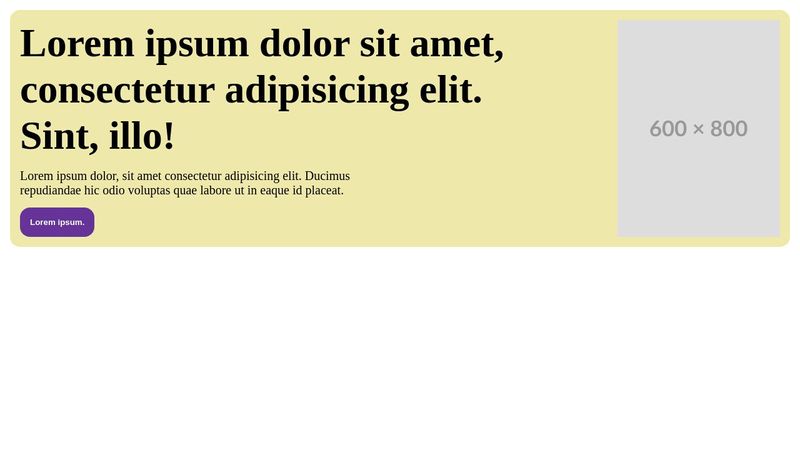
I've been given a design to replicate which is a two column grid layout. Text on the left, image on the right. The catch is the image should always be the same height as the text on the left. It also has to use grid and not flexbox, because I have to rearrange the order of the image from mobile to desktop.
I went through a few solutions, and the closest I got was using contain: size on the image, and having its natural aspect-ratio create a box for it to live in. While this does work in Chrome and Safari, Firefox is broken.
Is there perhaps a better way of doing this that I'm not thinking of?
https://codepen.io/nqunnjku-the-scripter/pen/pvjmPYQ

A friendly place for developers to meet other devs, ask questions, get help, and just have a good time 🙂.
36,263Members
Resources
Recent Announcements
Similar Threads
Was this page helpful?