Display the table correctly on Mobile and Desktop
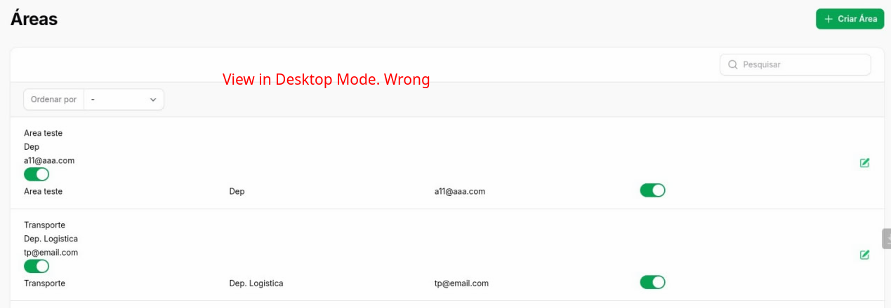
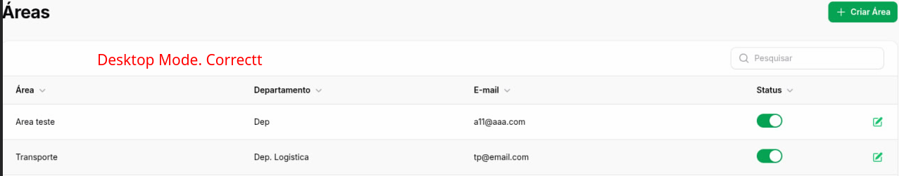
I'm using Filament version 3 and I need to create two layouts with Table Builder. One for the desktop, which will be the traditional layout, and the other for mobile, which will use Split to group the columns. The problem is that I used the code below, and both the desktop and mobile layouts ended up with the same mobile layout. Could someone please help me and tell me if I did it or how to do it to make it work?
public static function table(Table $table): Table
{
return $table
->columns([
Tables\Columns\TextColumn::make('name')
->label('Área')
->searchable()
->sortable()
->visibleFrom('md')
->limit(30),
Tables\Columns\TextColumn::make('departament.name')
->label('Departamento')
->searchable()
->sortable()
->visibleFrom('md')
->limit(30),
Tables\Columns\TextColumn::make('email')
->label('E-mail')
->searchable()
->sortable()
->visibleFrom('md')
->limit(30),
Tables\Columns\ToggleColumn::make('status')
->label('Status')
->visibleFrom('md')
->sortable(),
Split::make([
Tables\Columns\TextColumn::make('name')
->label('Área')
->searchable()
->sortable()
->limit(30),
Tables\Columns\TextColumn::make('departament.name')
->label('Departamento')
->searchable()
->sortable()
->limit(30),
Tables\Columns\TextColumn::make('email')
->label('E-mail')
->searchable()
->sortable()
->limit(30),
Tables\Columns\ToggleColumn::make('status')
->label('Status')
->sortable(),
])->from('md'),
])
