65 Replies
Hi @Seve @DOPΣ , could you please take a look at the video? I’ve put quite a bit of time into designing this dropdown.
looks sick, just some annoying stuff,

can u give pr link, so sev can review
yea and no arrows on the side of the dropdown
also i don't think the dropdown is a fixed size, and it's important for search to work
other than that, it looks pretty good!
yea i remove that 😅
ok sure raising pr in a while.
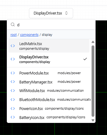
Also I don't like the "Files" and "Folders" subtitles in this case because I think the breadcrumbs make it obvious. I would comment it out and show us what that looks like
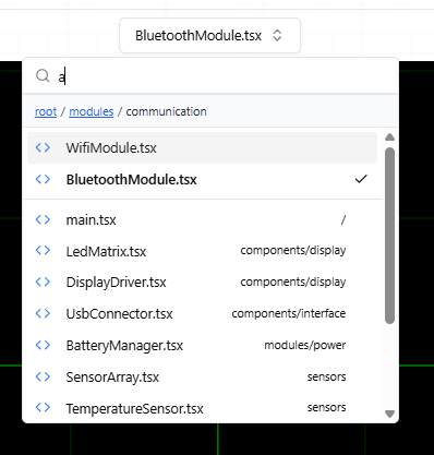
Text search is also very important, I think when a user is searching you want to show the current directory results separately than the global results (prioritize current directory on top) BUT when showing text search results i think you need to show the full path to file. So this behavior needs to be handled
Seve here is ss of without headers
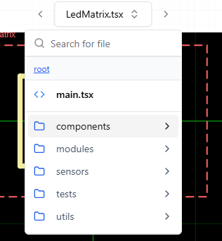
yea the spacing below main.tsx is off but otherwise good
we do need to see that text search is really good
it probably changes the component completely, because it needs to show full file paths i think
but idk
it just has to be really good
ya I'm now focusing on how to make it proper..as it currently only search for the particular directory
kk
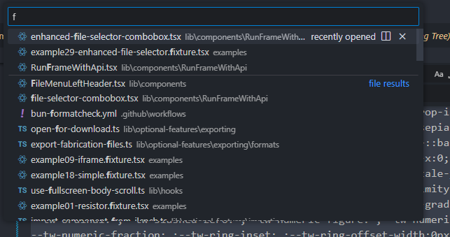
CMD+P in vscode is a good reference for how text search should work, needs to show all files but should prioritize current directory matches
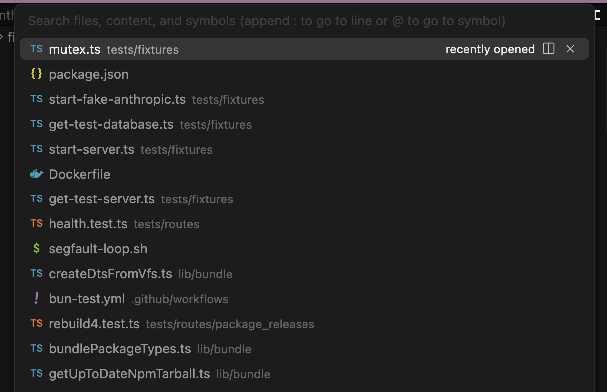
there's no point in showing clickable directories in the search, just files and path information
okay sure i will look into this and try to cook something up 😅
@Seve
- don't bold every file, you can bold the selected file (maybe)
- Don't say "in current directory", just show the path. We're prioritizing them, not changing the appearance
- The width is changing constantly, pick better min width
- Don't show the file path under the file, show the path to the directory, and show what it looks like on the right side as well, although i don't think we'll keep it, but this is what the vscode design reference does
umm about the min-width for the dropdown contents the min-width is fixed, but after the user searches the width changes. If I increase the width in general, it looks too wide for the content.
what you suggest for this ?
what does vs code do?
i think they just keep it wide
it can change, but not often, and not unnecessarily
okay i will try to mimic this
@Seve i tried to replicate this...also i fixed the margin inconsistency...
Yea the bottom part looks ok but not the top part, there’s no point in that second line for each item in the current directory
Also the scroll bar should really not appear unless it exceeds a larger height (maybe 2x) but also when the scroll bar appears it shouldnt jostle the content. After that youre probably done
sorry for repeated pings but if i remove the path for curr dir will it be ok or need to show that aswell?
also i fixed the dir naming with right align so it look more good hoping so🙂
here is updated one
yea that seems correct
nicely done
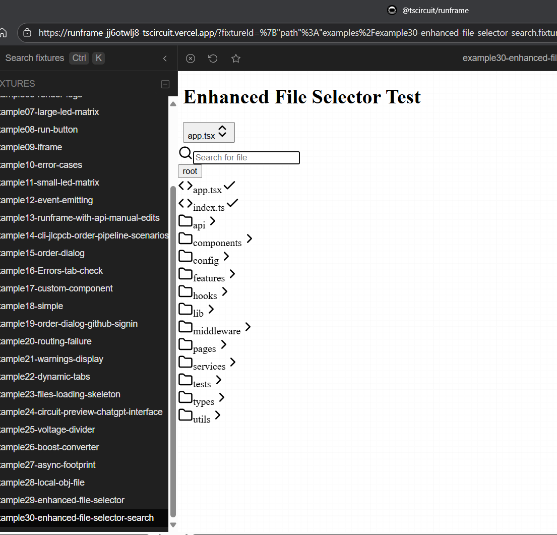
make sure i can test it on the preview server which doesn't support CLI, you might need to make a
components/searchmenu.fixture.tsx or something to allow it to be tested in previewokay sure i will try to make it preview ready also testing few things on my end aswell
thanks again for all quick reviews much appreciated!
@Seve https://github.com/tscircuit/runframe/pull/1169 can you approve the deploy so i can see if preview works
GitHub
feat(fileSelector): improve open file dropdown by Ayushjhawar8 · P...
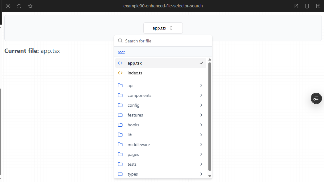
When you type, it prioritizes files in your current directory at the top
Files from other directories show below with their full paths
Search clears automatically when you close the dropdown
No mor...
Done
let me record another vid, or you can pull my branch into local if possible. either way 😅😅
Just got off a call, will review shortly!
Can @DOPΣ also review
uhm
yes i tried to deploy without api but its not coming up properly
Gotta get that working
You dont need to deploy to test that iiuc
Just disable the file server api in the vite config to test locally
Okay I will try this aswell
Can you review on basis of video as well. Thanks!
the preview has to work tho
i tested few things on local...lets see if this works
While testing, I noticed that when there's no space for new dir, the header gets cut off. What would be the ideal fix for this, increasing the container size or adding a horizontal scroll bar?
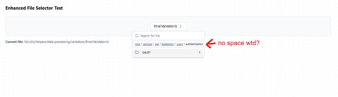
Container size is probably fine as a hack right now
A scrollbar wouldn’t be acceptable
Yayy its finally working in preview!! 🙂 🥳
okay i will try to fix that aswell
nice
@Seve I’ve tried to handle most of the edge cases on my end. Please check
@Seve as i pull the changes for resolving conflict i see a possible issue where the search box itself is moving?
gah
that PR sucks
@Roy N | AI disappoint
reverting
will look into it, what failed ?
look at the video above, it's moving all over the place
that change was only supposed to be when necessary, for small screens
also it looks like the loader/running has a really bad interaction
that's a re-render probably caused by the interaction on the File selector.
the circuit loading shouldn't cause the file selector to jump all over the place
no it's caused by running the circuit
@AyushJ it's reverted, if you merge now you shouldn't get that behavior
I've gotten the issue
um lemme revert on my end and test it
@AyushJ fwiw what i'd recommend is just
git fetch && git merge origin/main for merging upstream- i wouldn't recommend using git revert, just a notethe previous interaction made use of an absolute position to keep it in place always
so when the loading spinner came up, it didn't fidget
my implementation made it responsive but now the when you run a new file the loading spinner inserts and removes a new element in seconds disrupting the visual appearance
will fix
We want to, where possible, keep files below 400 lines. But you don't need to break this up much more than that.@Seve i managed to get the file size upto 440 is it passable? I’ve gone through both of your reviews and made the updates this one was quite a ride, I must say! 😁
GitHub
feat(fileSelector): improve open file dropdown by Ayushjhawar8 · P...
When you type, it prioritizes files in your current directory at the top
Files from other directories show below with their full paths
Search clears automatically when you close the dropdown
No mor...
awesome
@Seve is it mergable now?
👍
Thanks! 😊
thanks for the contrib
@Seve thoughts ?
i don't think this is the right solution, you should be able to get it spaced properly without having the loader effect the interaction, e.g. by making the loader not effect the layout via relative layout- @DOPΣ may be able to help review here as well
hmm, the loader isn't affecting the interaction
or are you referring to how the circuit is rendered on screen
the PR we reverted had a bug where the blue loader was causing flickering
In your new approach, you avoided the issue with left-align, but that's not acceptable