How do I achieve this? Is this a clip-path, a mask or what?

Good day. 
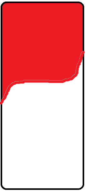
Trying to recreate this in CSS but I am completely lost. The red part should be an Image, and I am lost about how to actually handle the borders in that way. Does anybody perhaps know how to deal with this or have any resource that actually teach it? Thanks in advance.
No description
28 Replies
Keita & Akira
Keita & AkiraOP•2mo ago
(ignore the fact the horizontal line is not straight, just did a quick example with paint to give the idea)
Tok124 (CSS Nerd)
Tok124 (CSS Nerd)•2mo ago
You want something like this?
No description
Keita & Akira
Keita & AkiraOP•2mo ago
I want exactly that. However, it should be an image and not a red-shape
Keita & Akira
Keita & AkiraOP•2mo ago
I was able to make it work with a shape as well
No description
Keita & Akira
Keita & AkiraOP•2mo ago
But I did not find a way to handle this with an image Given that the image does not have a standard color
Tok124 (CSS Nerd)
Tok124 (CSS Nerd)•2mo ago
Oh alright... Yeah that is going to make it a little more difficult... Then you will need to use a mask or a clip-path yeah
Keita & Akira
Keita & AkiraOP•2mo ago
Yeah, thought so, but I am unable to replicate it Seems extremely harder than just do it with a basic-color-shape
Tok124 (CSS Nerd)
Tok124 (CSS Nerd)•2mo ago
Yeah i do not know very much about clip-path unfortunately. It is kinda using like svg path's... I did find a video very recently that explained kinda how to write your own path, it was super useful, i'll see if i can find it again...
Tok124 (CSS Nerd)
Tok124 (CSS Nerd)•2mo ago
https://www.youtube.com/watch?v=oWXm5n-Zi38 I think this was the video i watched @Keita & Akira try watch that and see if you can make the shape 🙂
CSSnippets
YouTube
Master CSS Clip-Path: Create Custom Shapes with One Line of Code!
In this video, I’ll show you how to use clip-path to create awesome shapes, effects, and even smooth animations - all without using SVGs or images. From simple circle, ellipse, rectangles to complex polygons and dynamic curves, you’ll learn step-by-step. This tutorial is beginner-friendly and packed with real examples. Whether you want to d...
Keita & Akira
Keita & AkiraOP•2mo ago
Uhm, will give it a check, hopefully I can find a solution to this
Tok124 (CSS Nerd)
Tok124 (CSS Nerd)•2mo ago
In the meantime i'll try make it work using a mask, and you can kinda choose what solution you wanna go with 🙂
Keita & Akira
Keita & AkiraOP•2mo ago
God bless you. It kinda became a challenge at this point, and I've spent the last 3 hours on it but without being able to achieve the result I wanted
Martin Bavio
Martin Bavio•2mo ago
@Keita & Akira you familiar with Clippy? Might help you here.
Keita & Akira
Keita & AkiraOP•2mo ago
I tried using it for the past hours, but with not many results I've been using the 'custom polygon' set
Martin Bavio
Martin Bavio•2mo ago
honestly a mask would be easier here since it's basically a b/w image that tells the browser what you show and what to hide, considering that you have that image already.
Tok124 (CSS Nerd)
Tok124 (CSS Nerd)•2mo ago
@Keita & Akira I got it to work with mask....
No description
Tok124 (CSS Nerd)
Tok124 (CSS Nerd)•2mo ago
You basicly just need to play around with mask-composite until it works ^^
Martin Bavio
Martin Bavio•2mo ago
@Tok124 (CSS Nerd) superb masking work!
Tok124 (CSS Nerd)
Tok124 (CSS Nerd)•2mo ago
Thanks ! 😄
Tok124 (CSS Nerd)
Tok124 (CSS Nerd)•2mo ago
https://codepen.io/tok124/pen/pvggqdw Here is my pen, i added a custom css property so you can change the size of the border-radius thing...
Tim
CodePen
Untitled
...
Keita & Akira
Keita & AkiraOP•2mo ago
You are amazing, thanks a lot!
Tok124 (CSS Nerd)
Tok124 (CSS Nerd)•2mo ago
No problem man 🙂 @Keita & Akira Btw... If you really need good browser support you should use this
body {
min-height: 100svh;
align-content: center;
}

.phonescreen {
--bdrs:3rem;
width: 300px;
aspect-ratio: 9/16;
margin-inline: auto;
border-radius: 2rem;
overflow: clip;
border: 2px solid black;
position: relative;
}
.phonescreen .top-half {
position: absolute;
inset: 0;
background: url(//unsplash.it/300/500) center/cover no-repeat;
-webkit-mask:
linear-gradient(red 50%, #0000 0),
radial-gradient(circle at 100% 100%, #0000 71%, red 0) 0 calc(50% + (var(--bdrs) / 2))/var(--bdrs) var(--bdrs) no-repeat,
radial-gradient(circle at 0 0, #0000 71%, red 0) 100% calc(50% - (var(--bdrs) / 2))/var(--bdrs) var(--bdrs) no-repeat;
-webkit-mask-composite: xor;
mask:
linear-gradient(red 50%, #0000 0) exclude,
radial-gradient(circle at 100% 100%, #0000 71%, red 0) 0 calc(50% + (var(--bdrs) / 2))/var(--bdrs) var(--bdrs) no-repeat,
radial-gradient(circle at 0 0, #0000 71%, red 0) 100% calc(50% - (var(--bdrs) / 2))/var(--bdrs) var(--bdrs) no-repeat;
}
Keita & Akira
Keita & AkiraOP•2mo ago
Oh, that's nice. Thanks for thinking about it
Tok124 (CSS Nerd)
Tok124 (CSS Nerd)•2mo ago
No problem 🙂 I have autoprefixer on codepen so i don't need to worry about it on codepen haha
Keita & Akira
Keita & AkiraOP•2mo ago
I just had the chance to test it and it works almost perfectly for my case. Thanks a lot once again, your help has been super precious. Wish you the best
Martin Bavio
Martin Bavio•2mo ago
@Tok124 (CSS Nerd) following you in codepen now, you are doing pretty awesome CSS work in there!
Tok124 (CSS Nerd)
Tok124 (CSS Nerd)•2mo ago
Thanks man ! Yeah i mostly just use codepen for helping others so honestly most of my pens is junk, that's why i created collections of my own pens 🙂 So you can check the collections page on my profile and you may see some cool stuff 🙂

Did you find this page helpful?