Opinions about a design
I was looking through the projects I did during the odin project and I came across this.
https://www.theodinproject.com/lessons/node-path-advanced-html-and-css-homepage
There are design photos given in the step one. I didn't question it at the time but doesn't this seem quite nightmareish from a dev perspective?
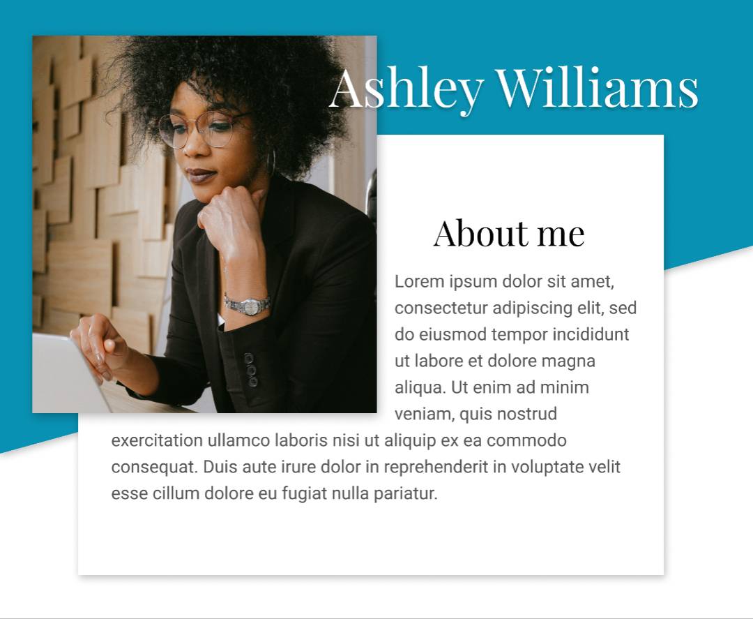
Especially the section from tablet design I'm screenshotting below.
https://www.theodinproject.com/lessons/node-path-advanced-html-and-css-homepage
There are design photos given in the step one. I didn't question it at the time but doesn't this seem quite nightmareish from a dev perspective?
Especially the section from tablet design I'm screenshotting below.

