<template>
<UHeader
:ui="{
container: 'overflow-visible',
center: 'flex items-center gap-3 flex-1 overflow-visible'
}"
>
<template #left>
</template>
<UNavigationMenu
:items="items"
variant="link"
:teleport="true"
:ui="{
viewport: 'sm:w-[75vw] max-w-[1280px] left-1/2 -translate-x-1/2 z-[60]',
content: 'sm:w-auto',
childList: 'sm:w-96',
childLinkDescription: 'text-balance line-clamp-2'
}"
class="w-full justify-center"
>
<template
v-for="navItem in items.filter((i: any) => i.slot && i.content)"
:key="navItem.slot"
#[`${navItem.slot}-content`]="{ item }"
>
<ul class="grid gap-2 p-4 w-full sm:w-[75vw] lg:grid-cols-2">
<!-- Image/Video content - spans multiple rows, positioned left or right -->
<li
v-if="item.content"
:class="[
'row-span-3 overflow-hidden',
item.content.position === 'right' ? 'lg:col-start-2 lg:row-start-1' : 'lg:col-start-1 lg:row-start-1'
]"
>
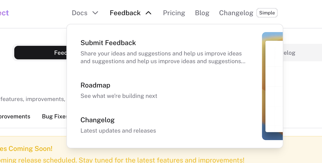
<Placeholder />
</li>
<!-- Navigation items - positioned opposite to image -->
<li
v-for="child in item.children"
:key="child.label"
:class="item.content?.position === 'right' ? 'lg:col-start-1' : 'lg:col-start-2'"
>
<ULink
:to="child.to"
class="block text-sm rounded-md p-3 transition-colors hover:bg-elevated/50 w-full"
>
<div class="font-medium text-highlighted mb-1 overflow-hidden text-ellipsis">
{{ child.label }}
</div>
<div class="text-muted text-xs line-clamp-2 break-words overflow-hidden">
{{ child.description }}
</div>
</ULink>
</li>
</ul>
</template>
</UNavigationMenu>
<template>
  <UHeader
    :ui="{
      container: 'overflow-visible',
      center: 'flex items-center gap-3 flex-1 overflow-visible'
    }"
  >
    <template #left>

    </template>

    <UNavigationMenu
      :items="items"
      variant="link"
      :teleport="true"
      :ui="{
        viewport: 'sm:w-[75vw] max-w-[1280px] left-1/2 -translate-x-1/2 z-[60]',
        content: 'sm:w-auto',
        childList: 'sm:w-96',
        childLinkDescription: 'text-balance line-clamp-2'
      }"
      class="w-full justify-center"
    >
      <template
        v-for="navItem in items.filter((i: any) => i.slot && i.content)"
        :key="navItem.slot"
        #[`${navItem.slot}-content`]="{ item }"
      >
        <ul class="grid gap-2 p-4 w-full sm:w-[75vw] lg:grid-cols-2">
          <!-- Image/Video content - spans multiple rows, positioned left or right -->
          <li
            v-if="item.content"
            :class="[
              'row-span-3 overflow-hidden',
              item.content.position === 'right' ? 'lg:col-start-2 lg:row-start-1' : 'lg:col-start-1 lg:row-start-1'
            ]"
          >
            <Placeholder />
          </li>

          <!-- Navigation items - positioned opposite to image -->
          <li
            v-for="child in item.children"
            :key="child.label"
            :class="item.content?.position === 'right' ? 'lg:col-start-1' : 'lg:col-start-2'"
          >
            <ULink
              :to="child.to"
              class="block text-sm rounded-md p-3 transition-colors hover:bg-elevated/50 w-full"
            >
              <div class="font-medium text-highlighted mb-1 overflow-hidden text-ellipsis">
                {{ child.label }}
              </div>
              <div class="text-muted text-xs line-clamp-2 break-words overflow-hidden">
                {{ child.description }}
              </div>
            </ULink>
          </li>
        </ul>
      </template>
    </UNavigationMenu>
