17 Replies
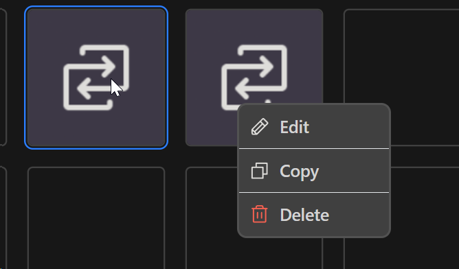
Issue: Left clicking a macro the little menu with edit, copy and delete appears. If I click off the area in the dark gray BG, it closes as expected, but if i click off by clicking another macro or the macro settings it doesn't dissapear

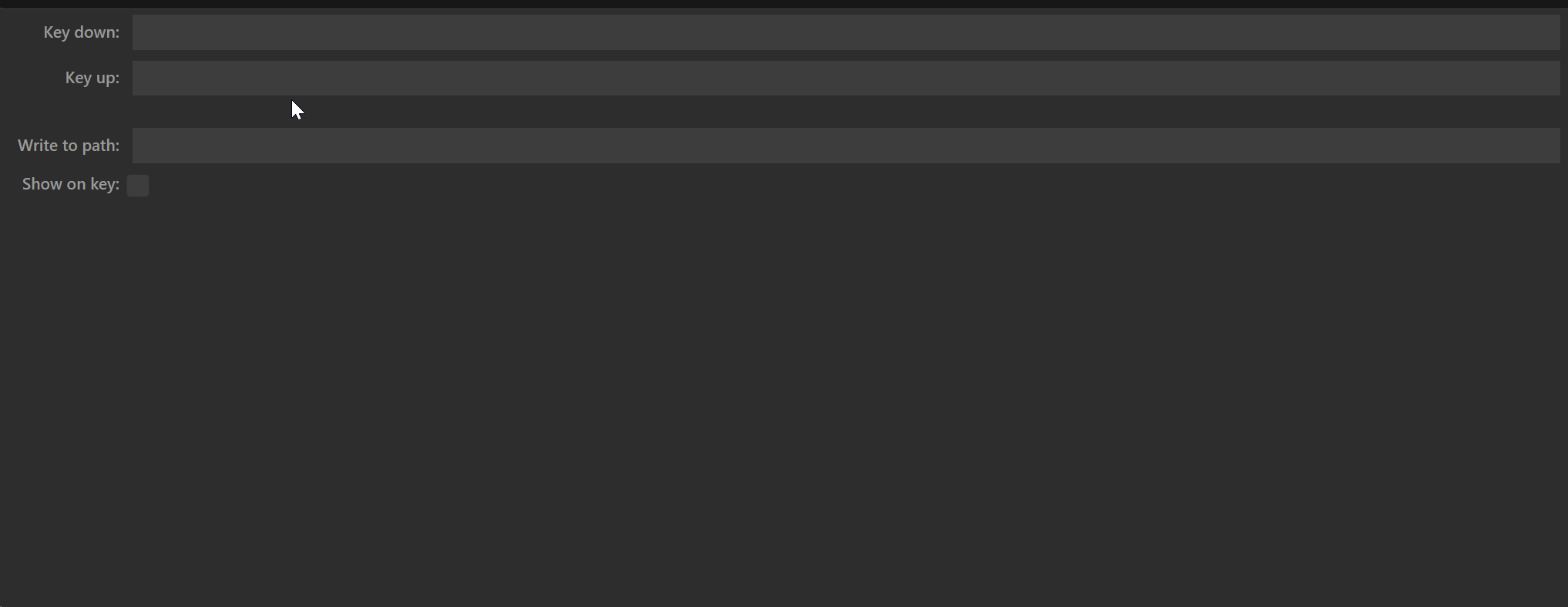
In terms of suggestions, there is a ton of empty space in the bottom tab when editing a macro. I feel like this could be solved by the tab having enough height to fit the content or let the user resize it

There's also a UI inconsistency where the settings for Run Command stretch to fill the width of the tab (I like that) but here in Input Simulation it only goes up to a certain width

Would be nice for the above to stretch to fill the tab and its empty space
There's also this scrollbar on the X axis which seems to be unnecessary in Multi Action

A UX improvement woudl be to have the ability to reorder actions within Multi Action as to introduce intermediary steps, I have to delete later steps, introduce the new step(s) and remake the deleted ones
May be on the more nitpicky side but there's also some scaling inconsistency with things like inputs being very small and the macro icons and the actions within Multi Action being very big, I feel like the latter case is especially an issue since each action only has a short title yet the card surrounding it uses a ton of space and it's hard to have a broader view of everything that happens in the Multi Action, this could also be solved by something mentioned prior (allowing the tab below it to be resized)
There is an open PR regarding UI/UX revamp. Ypu could check there if these things are maybe resolved.
That PR is very very stale and also does not address these points, it mainly addresses nitpicky cursor things
i can fix this one
it was originally the other way around where Run Command and the others were actually smaller (the same width but a single line), but they got expanded in v2.6.1
so should Input Simulation look the same? I can make it the same, single line full width, then everything will be consistent
probably can fix this one easily too
resizing it would just leave empty space between it and the grid above... you should just size your window so that it isn't too tall
ok. wasn't sure anymore if these issues were adressed or not.
I think Input Simulation should be updated to look the same, yeah
You are right when it comes to viewing macros, but it is a bit annoying when making a Multi Action as that empty space can now serve to fit more steps on the screen
fixed this on the main branch
wanted to fix this but it wasnt visible on my mac so ill wait until im on my PC to fix it (if i can see it happening then i know when ive fixed it or not)
couldnt reproduce this on mac nor on linux.
do you also see that X scrollbar in the plugins manager, the settings page, or the profile list?
In the plugins manager and settings page page yes, the profile list no
since you're on windows, I presume you dont have an easy way to build from source like people can on Arch, but I just pushed a commit which may help to fix the unnecessary scrollbars
I can no longer test this as I have officially migrated to Linux lol
But thanks for addressing the issue!
welcome to the club!
Thanks!
I've fixed this now too
on the main branch