Why is justify-self not working at certain widths?
I have a simplified non-working example at https://codepen.io/thejgc/pen/zxqvzOa of a grid layout.
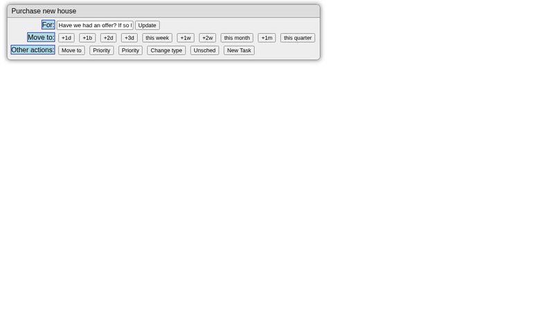
At most widths it works fine, with the
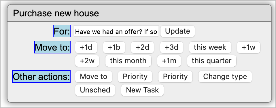
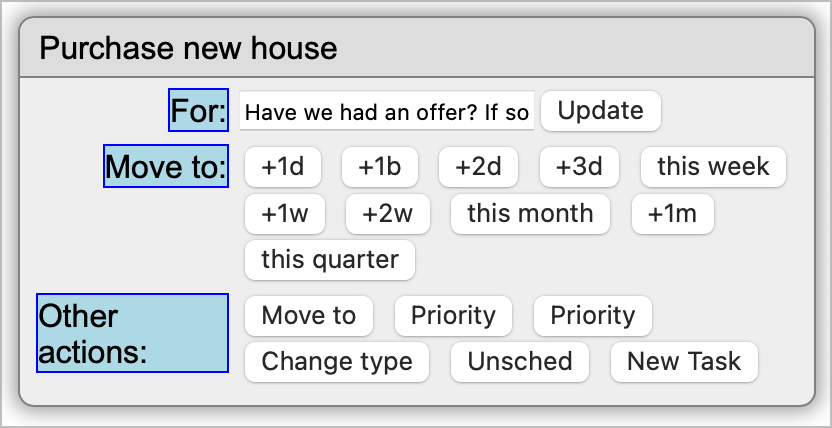
But when the window is narrowed, and the text in the class has to wrap, the alignment seems to stop working.
I have tried
What am I missing?
At most widths it works fine, with the
preTextjustify-self: end;But when the window is narrowed, and the text in the class has to wrap, the alignment seems to stop working.
I have tried
justify-self: flex-end; justify-self: self-end;What am I missing?


