screen rotation problem
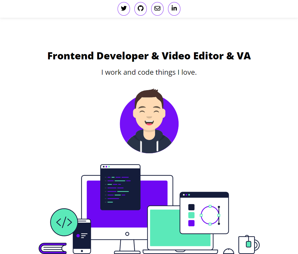
so i made my layout and it looks good but i realized that in mobile rotations the site will have problems so i checked it and i was right i made the landing 100vh so that's like really small area in mobile rotations size so it over lab
22 Replies
normal thing
mobile rotation
Need code but again its cause you are using absolute position
put it in a pen
i know there's a media queries for landscape mode but i think if i make it it will effect ipads too
i'm doing that
https://codepen.io/IQmuneer/pen/abGYZgJ
i change the background of the page to red to make it easier to read
you need to get away from using ViewPort units
Learn the why and dos donts first
i realized that while i was thinking about it
on mobile viewport it is really small
setting strict heights no matter the unit is typically bad too
on rotations
use min/max
also this demo does not show the issue ?
is there a way to change the view port of the codepin ?
I mean yea slide the view
or use devtools
that's the problem in mobile rotation a position absolute would be over the hero
should i use media queries i know there's on for landscape
Litterly just remove the absolute stuff and it works
but i'm afride it would effect tablets that way
it looks cool : (
You don't need it
like I don't get why you are using it to start just put it below the other image
display: block
i want the img to be on the bottom of the landing
Again beck and both told you the right tools
https://codepen.io/b1mind/pen/PojdyQz here is both a grid/flex example
I prefer the grid method obviously cause you have more control
i'll test things out with grid rn
auto is handy but you can also do min/max-content, then you can also position x/y where you want with start/end/center align/justify
content
will keep stretch on children while items
will make them only their max-contentdid it great !
this is way more better than setting absolute since it can get over stuff
great thing to know and to keep in mind for future stuff
thank you for the help b1mind