Gap below image in CSS Grid

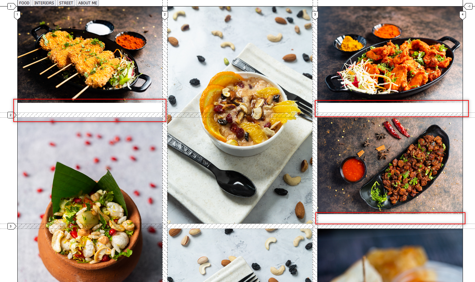
How do I avoid the gap below the image. I'm using max-width:100% display: block; If this information is not enough. I'll share codepen. Thanks in advance
26 Replies
Jochem
Jochem3y ago
looks like the images aren't tall enough to fit in the grid looks like you've got the tall images spanning two grid cells, and the short images only one, which would mean the short images need to be ~half the height of the tall ones (plus or minus some maths)
Abdul Ahad⚡
Abdul Ahad⚡3y ago
Im using
grid-row: span 2 / auto;
for tall images I need to use
grid-row: span 1/ auto;
for short right?
Jochem
Jochem3y ago
I'm not that familiar with grid layouts, honestly. I'm just noting that the images can't fill the entire grid cell if they're not the same size
b1mind
b1mind3y ago
Object-fit: cover. Could help you will crop some of them but I what try
argbet
argbet3y ago
@abdulahad Try adding min-height: 100%; to your <img> tag
Abdul Ahad⚡
Abdul Ahad⚡3y ago
got it. thank you so much.😁 been trying for 2-3 hrs.
b1mind
b1mind3y ago
Yea you need a height for cover to work https://codepen.io/b1mind/pen/VwxdKXQ
argbet
argbet3y ago
I heard using height was bad practice, but I assume min-height is okay right? Or na?
b1mind
b1mind3y ago
setting strict heights is typically bad ya. Always if you know why you can choose if you need. but yea min-height lets content grow still
argbet
argbet3y ago
👌
Abdul Ahad⚡
Abdul Ahad⚡3y ago
I'm getting it again, don't know why
Myndi
Myndi3y ago
What if you use height: 100%; instead?
Abdul Ahad⚡
Abdul Ahad⚡3y ago
it's same
Abdul Ahad⚡
Abdul Ahad⚡3y ago
before the gap was for every image. Now, it's only for single row, in all pages
MarkBoots
MarkBoots3y ago
if the image is the grid-item, then
img {
width: 100%;
height: 100%;
object-fit: cover;
}
img {
width: 100%;
height: 100%;
object-fit: cover;
}
should work
Abdul Ahad⚡
Abdul Ahad⚡3y ago
div is the grid item img is under div
Myndi
Myndi3y ago
If you have an aspect-ratio pattern you could try that as well. aspect-ratio: 1/2; or aspect-ratio: 2/1; depending on your needs.
MarkBoots
MarkBoots3y ago
div is the grid, the images are the items, that's what i meant
Abdul Ahad⚡
Abdul Ahad⚡3y ago
So i should remove the divs and make img as item directly
MarkBoots
MarkBoots3y ago
that is not the same as the codepen please share the css part of that too
Abdul Ahad⚡
Abdul Ahad⚡3y ago
img{
max-width: 100%;
height: 100%;
display: block;
object-fit: cover;
}

.img-grid2{
display: grid;
gap: 1rem;
grid-template-columns: repeat(auto-fit, minmax(350px, 1fr));
/* grid-auto-rows: auto 1fr; */
grid-auto-flow: dense;
}
.hs2{
height: 700px;
grid-row: span 2 / auto;
}
.hs1{
height: 350px;
grid-row: span 1 / auto;
}
MarkBoots
MarkBoots3y ago
remove the heights
Abdul Ahad⚡
Abdul Ahad⚡3y ago
sorry about that got it. Thank you so much
MarkBoots
MarkBoots3y ago
if you really want 350px rows then you can use grid-auto-rows: 350px on .img-grid{} but my advise is not to do, if not necessary the grid-auto-flow: dense is a bit redundant in this scenario and grid-row: span 2 is enough ( without / auto) also the class .hs1 is not really nessessary, it allready has the default beheaviour
Abdul Ahad⚡
Abdul Ahad⚡3y ago
Understood. Corrected them. You guys go far beyond to help us. This community is awesome. Again, Thank you
Want results from more Discord servers?
Add your server