Responsive card sizing
Hi,
I'm attempting to make a responsive layout for a card display. I have three objectives :
- Cards should all be the same size.
- There should be as many cards on a row as possible.
- Cards should expand to fill remaining space.
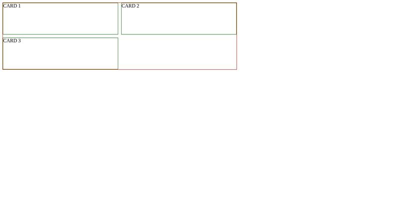
I tried it with flex in the following codepen. I could check the last two goals, but not the first one. How can i force the last one to have the same size as siblings ?
https://codepen.io/quentin7381/pen/WNyXEmq
I'm attempting to make a responsive layout for a card display. I have three objectives :
- Cards should all be the same size.
- There should be as many cards on a row as possible.
- Cards should expand to fill remaining space.
I tried it with flex in the following codepen. I could check the last two goals, but not the first one. How can i force the last one to have the same size as siblings ?
https://codepen.io/quentin7381/pen/WNyXEmq

A friendly place for developers to meet other devs, ask questions, get help, and just have a good time 🙂.
36,263Members
Resources
Recent Announcements
Similar Threads
Was this page helpful?