Getting to Intrinsic web (ala Jen Simmons) and Fluid responsive design (ala Utopia)
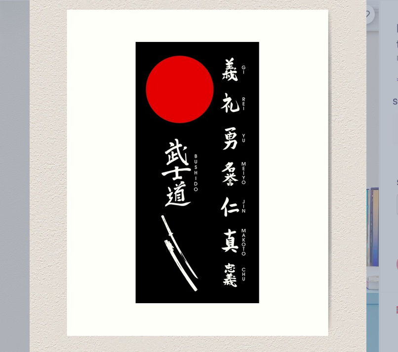
So I have made this japanese style card, as seen in the image (the sword is missing, but that's not the main issue her), and now I want it to respond to the viewport according to the principles of Jen Simmons (https://youtu.be/20QKda7IhJQ?t=1764) with regards to the
1. How to make the
2. How to scale the content within the black box in harmony with the scaling of the abovementioned
As you can see my entire page is a grid layout (because that's the challenge I've given myself to practice Jen's principle), and so somewhere there issue 1. has it's answer. If then issue 2. is locked somehow to the behaviour of issue 1., it should automatically solve itself. I tried putting clamp (as the Utopia guys propose) on the fonts, and it worked on it's own, but since I haven't figured out issue 1. it breaks down.
... and since the principle here is intrinsic web design and fluid responsive design, this should be possible without
https://codepen.io/amarlong/pen/vYraJLz
.content1. How to make the
.content2. How to scale the content within the black box in harmony with the scaling of the abovementioned
.contentAs you can see my entire page is a grid layout (because that's the challenge I've given myself to practice Jen's principle), and so somewhere there issue 1. has it's answer. If then issue 2. is locked somehow to the behaviour of issue 1., it should automatically solve itself. I tried putting clamp (as the Utopia guys propose) on the fonts, and it worked on it's own, but since I haven't figured out issue 1. it breaks down.
... and since the principle here is intrinsic web design and fluid responsive design, this should be possible without
@mediahttps://codepen.io/amarlong/pen/vYraJLz
YouTubeMozilla
2017 saw a sea change in web layout, one that few of us have truly come to grips with. We’re standing at the threshold of an entirely new era in digital design—one in which, rather than hacking layouts together, we can actually describe layouts directly. The benefits will touch everything from prototyping to custom art direction to responsive de...


A friendly place for developers to meet other devs, ask questions, get help, and just have a good time 🙂.
36,263Members
Resources
Was this page helpful?