Where does extra height for row come from when using grid?
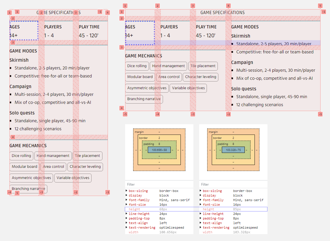
Hello! I'm unable to figure out why a row grows in height using grid in the responsive layout shown in the picture (extra height highlighted in blue). The mobile-first definition of the grid is as follows:
The media query for desktop just expands the grid's columns a bit and moves elements around, no size or spacing changes whatsoever:
As shown on the bottom right of the picture, the height for the selected element ("Ages 14+", as well as that of the other 2 siblings also rendered in the same row both on mobile and desktop) grows from 68 to 85px. Could anyone clarify what may be leading to such behavior? Thank you in advance!

A friendly place for developers to meet other devs, ask questions, get help, and just have a good time 🙂.
36,263Members
Resources
Similar Threads
Was this page helpful?