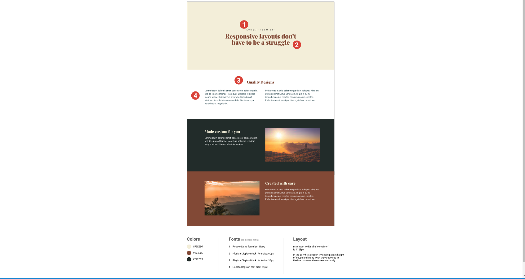
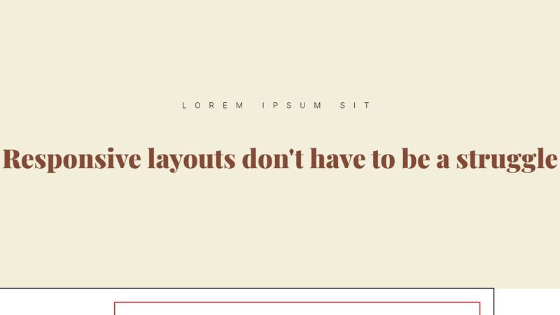
Getting the layouts correct with flex for each section.
Having trouble seeing why my sections aren't lining up properly with flex. It seems I can get them to line up close but they dont seem to meet the image below. Am I doing something wrong with my html setup or is it an issue with my flexbox setups? I'm not sure what width to consider for them.
https://codepen.io/MD-2016/pen/oNMZRWp
https://codepen.io/MD-2016/pen/oNMZRWp


