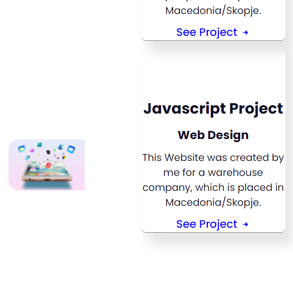
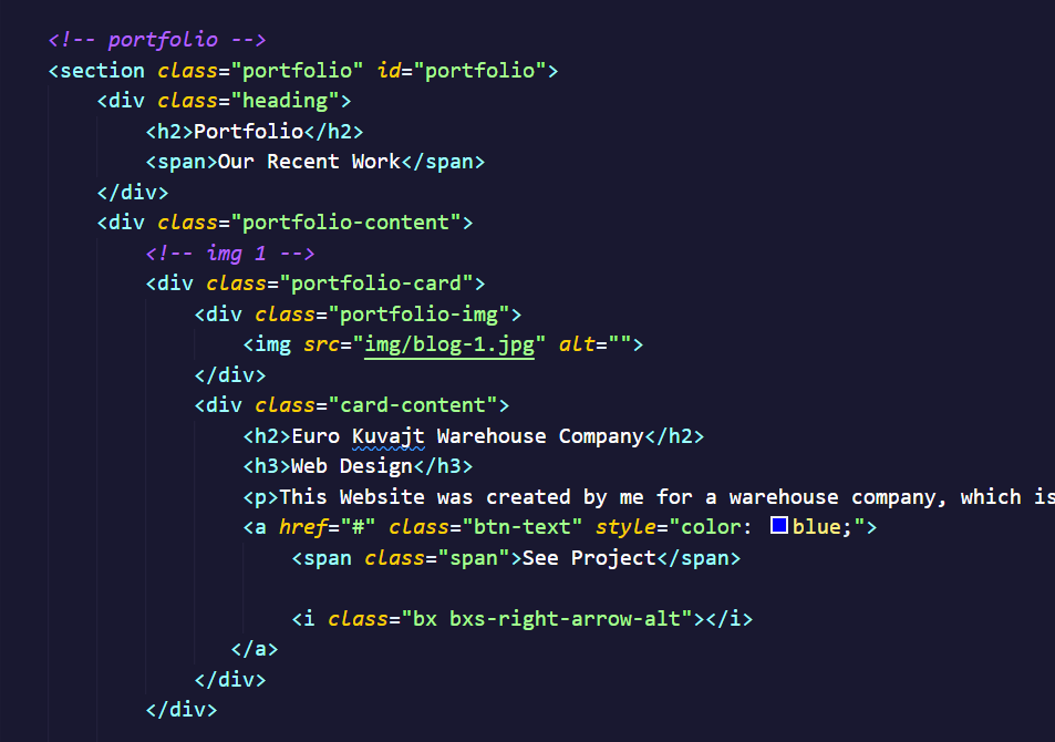
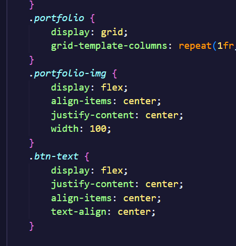
I need help on making projects section responsive

how can i make this on responsive way, i've been trying so hard but still i can't help it
20 Replies
Unknown User
Unknown Userā€¢17mo ago
Message Not Public
Sign In & Join Server To View
Mannix
Mannixā€¢17mo ago
I see u use grid so I would put the grid-template-columns in a min-width media-query
samidev
samidevā€¢17mo ago
@Mr.Life.Hacker ye i will elaborate it in better way so besically this code is in @media queries

.portfolio {
display: grid;
grid-template-columns: repeat(1fr, 1fr);
}
.portfolio-img {
display: grid;
align-items: center;
justify-content: center;
width: 100;
}
.btn-text {
display: flex;
justify-content: center;
align-items: center;
text-align: center;
}

.portfolio {
display: grid;
grid-template-columns: repeat(1fr, 1fr);
}
.portfolio-img {
display: grid;
align-items: center;
justify-content: center;
width: 100;
}
.btn-text {
display: flex;
justify-content: center;
align-items: center;
text-align: center;
}
<section class="portfolio" id="portfolio">
<div class="heading">
<h2>Portfolio</h2>
<span>Our Recent Work</span>
</div>
<div class="portfolio-content">

<div class="portfolio-card">
<div class="portfolio-img">
<img src="img/blog-1.jpg" alt="">
</div>
<div class="card-content">
<h2>Euro Kuvajt Warehouse Company</h2>
<h3>Web Design</h3>
<p>This Website was created by me for a warehouse company, which is placed in Macedonia/Skopje.</p>
<a href="#" class="btn-text" style="color: blue;">
<span class="span">See Project</span>

<i class="bx bxs-right-arrow-alt"></i>
</a>
</div>
</div>
samidev
samidevā€¢17mo ago
samidev
samidevā€¢17mo ago
samidev
samidevā€¢17mo ago
so when it is in mobile i want it to be the picture above the text
Mannix
Mannixā€¢17mo ago
what media-query did you use then?
WebMechanic
WebMechanicā€¢17mo ago
what's grid-template-columns: repeat(1fr, 1fr); supposed to do? the 1st value should be a number or one of auto-fill/auto-fit
Mannix
Mannixā€¢17mo ago
create 2 equal columns
WebMechanic
WebMechanicā€¢17mo ago
no it doesn't. repeat() takes a number and then the values/sizes that need repeating. Equal columns would be: grid-template-columns: 1fr, 1fr;
WebMechanic
WebMechanicā€¢17mo ago
Mannix
Mannixā€¢17mo ago
oh yeah i didn't even noticed that it should be repeat(2, 1fr)
WebMechanic
WebMechanicā€¢17mo ago
looks better šŸ™‚ fwiw that's more characters and "too complex code" for what a simple 1fr, 1fr would do. I only use repeat for the auto-* guys or if there are plenty of same size patterns to be repeated, that would be hard to read and count if typed out manually.
samidev
samidevā€¢17mo ago
@mannix_ here
samidev
samidevā€¢17mo ago
and still cant fix ittt i fix it but now i have problem how can i put image in the middle
samidev
samidevā€¢17mo ago
samidev
samidevā€¢17mo ago
Mannix
Mannixā€¢17mo ago
try justify-content: center; on the parent of that image
WebMechanic
WebMechanicā€¢17mo ago
poor clients trusting you with their web projects ... šŸ™ˆšŸ™Š
samidev
samidevā€¢17mo ago
bro acting like he is better , while he use bootstrap šŸ˜‰ but dw about it i fixed it in all devices so ye
Want results from more Discord servers?
Add your server
More Posts