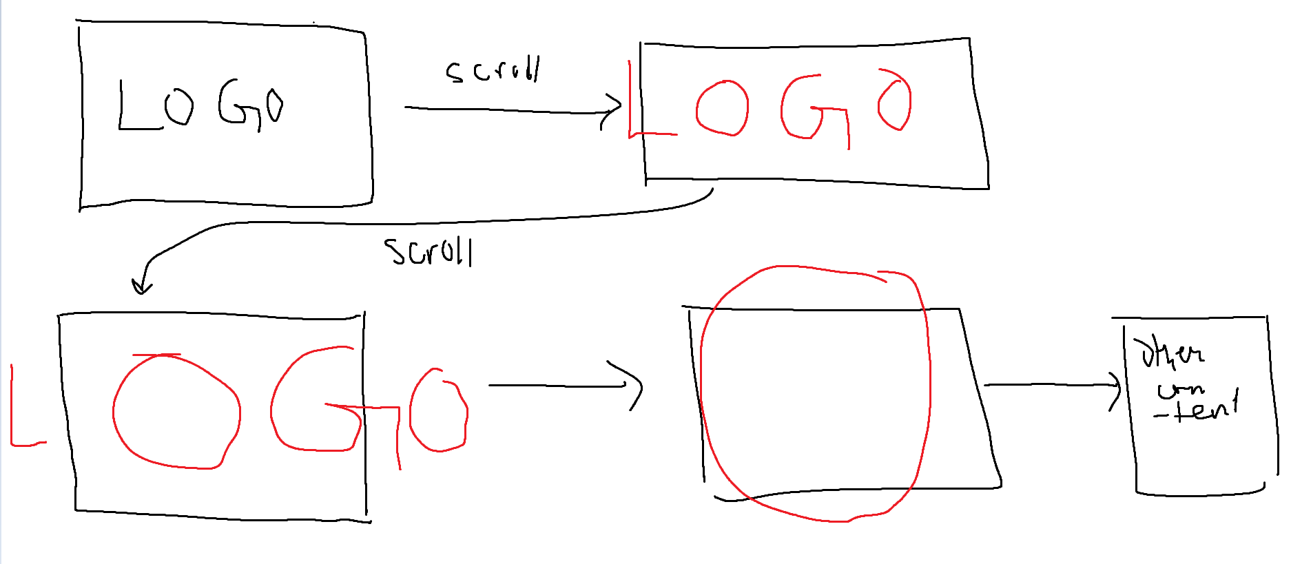
Zoom through logo to content behind upon scroll

I have a logo with an O in it, and I want it such that , when the user scrolls it increases in size and eventually goes through the O in the logo and shows the "next slide" or the content that would be otherwise below it. Do I need something like three.js for this?
16 Replies
henry
henry17mo ago
so basically, I want it to zoom through this
henry
henry17mo ago
henry
henry17mo ago
also how do I achieve this two-tone effect I have going on, I've made this in photoshop , but how do I make anything below that pinkish color curve a different color
MarkBoots
MarkBoots17mo ago
the two tone effect you can do by laying 2 layers on top of eachoter with the same text, and a mask on the top layer. something like this https://codepen.io/MarkBoots/pen/oNMVoMj?editors=1111 I did it with text, but it could be images as well
MarkBoots
MarkBoots17mo ago
WebMechanic
WebMechanic17mo ago
sounds like something Scroll-Linked Animations and scroll-timeline' could do, but it's still early and only experimental. Maybe use them as a progressive enhancement and eventually all visitors will see this. It's nothing I would spend too much time on or throw tons of JS at your visitors to get it done. It's just eye candy after all w/o any special purpose. https://caniuse.com/css-scroll-timeline You may link an IntersectionObserver and the offset values for the sections that scroll out of the viewport to some CSS properties that scale the logo and mask. Many masks. I can't even think of how to setup the document and (repetitive) element structure for the O-zoom, to show the next layer where another instance of the logo is visible and repeat from there... Also sounds like an accessibility nightmare to come true 🙂
henry
henry17mo ago
I ditched the zoom idea after thinking about it for a while , and I did something else instead ( ill post a demo of that soon ) but I wanted to know how exactly to achieve this, when the layer below is moving, also I want that pink area to be like a proper circle or something else like an svg, how would I do this then? do I just replace the mask image with a svg in that case? would that work?
MarkBoots
MarkBoots17mo ago
yes, now i use mask image with a gradient, but you can use an svg for that
henry
henry17mo ago
also what if I just have one element and I just a ::before or ::after will they share the animations?
MarkBoots
MarkBoots17mo ago
you could do it with pseudo elements instead of the 2 divs yes
henry
henry17mo ago
window.addEventListener("scroll", (e) => {
// let scaleRate = (window.scrollY > 0 ? window.scrollY : 1) * 0.1;
let scale = 1 - window.scrollY * 0.001;

// ${window.scrollY > 600 ? `position: absolute` : `position: fixed`};
logo.current.style = `
transform:${window.scrollY < 300 ? `scale(${scale})` : `scale(${1 - 300 * 0.001})`} ${window.scrollY > 300 && window.scrollY < 600 ? `translateX(${-((window.scrollY - 300)*0.1) + "vw"})` : window.scrollY > 599 ?
`translateX(-30vw)`:``}
${window.scrollY > 600 ? `translateY(${-(window.scrollY - 600) + "px"})` : `translateY(0px)`}
;
`;

window.scrollY > 300 ?
logo.current.children[1].children[0].setAttribute("data-motion", "fade-out") :
logo.current.children[1].children[0].setAttribute("data-motion", "fade-back");
window.scrollY > 400 ?
logo.current.children[1].children[1].setAttribute("data-motion", "fade-out") :
logo.current.children[1].children[1].setAttribute("data-motion", "fade-back");
window.scrollY > 500 ?
logo.current.children[1].children[2].setAttribute("data-motion", "fade-out") :
logo.current.children[1].children[2].setAttribute("data-motion", "fade-back");
});
dont mind the sloppy code, but this would apply to the top element, would the pseudo element follow suit? or will I need to the same code for that too? ( this is in react / nextjs ) the logo variable is a useRef hook instance
MarkBoots
MarkBoots17mo ago
is the data-motion for a library, or do you use it in css yourself? it all depends how it is being used. Can not tell without actual running code. If you need help with that, I would ask for a simple demo in a codepen
henry
henry17mo ago
I use it in css myself its not a library its just a custom tag, which is attached to this
.landing span[data-motion="fade-out"] {
animation: fade-up 400ms forwards ease;
}

.landing span[data-motion="fade-back"] {
animation: fade-back 400ms forwards ease;
}


@keyframes fade-up {
from {
opacity: 1;
transform: translateY(0px);
}
to {
opacity: 0;
transform: translateY(-30px);
}
}

@keyframes fade-back {
to {
opacity: 1;
transform: translateY(0px);
}
from {
opacity: 0;
transform: translateY(-30px);
}
}
henry
henry17mo ago
GitHub
GitHub - itshenryx/inoc-web: Web app for inoc/innoCare, built with ...
Web app for inoc/innoCare, built with React,Next and goLang. - GitHub - itshenryx/inoc-web: Web app for inoc/innoCare, built with React,Next and goLang.
MarkBoots
MarkBoots17mo ago
oh, okay yea i think pseudo will follow. its only opacity and transform, pseudo's are attached to the main element
henry
henry16mo ago
oh alright , ill try it out and let you know then, thanks ❤️ @markboots. how do I use a ::before or ::after without changing the content