Issues with cards in responsive design

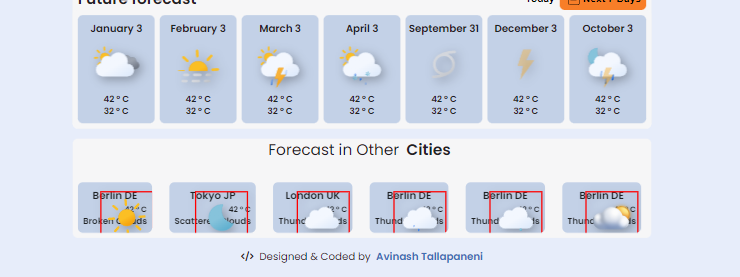
im having issues with cards in responsive design, i narrowed down the issue to images where i declared position:absolute in normal design without declaring relative parent, and the images sat in its place...... now in responsive its having this wierd positioning, i removed position : absolute for normal design its working properly but in normal mode images are way off https://codepen.io/avinash-tallapaneni/pen/ExRomwX
19 Replies
glutonium
glutonium2y ago
aah have u tried giving position relative to the parents in responsive?
Wolle
Wolle2y ago
It does not seem that you want things to be atop each other, so why use position: absolute? If you use position you are 100% responsible where those elements are on each screen size. I would recommend to only use it if you can't achieve it in other ways.
Avinash
Avinash2y ago
i found the issue. I redid the css part of that section and replaced it with grid instead of flex. Now i faced another issue @ʙᴏᴏʙ 2.0 @daswolle now the jc is space between
glutonium
glutonium2y ago
there are no space between for grid that only works for flex what's jc
Wolle
Wolle2y ago
Can you please explain what your problem is exactly?
Avinash
Avinash2y ago
i found the issues. its working. thumbup
glutonium
glutonium2y ago
noice
Wolle
Wolle2y ago
And to clarify: if you want space between the elements use gap, justify-content only distributes the remaining space.
Avinash
Avinash2y ago
one doubt tho, let say i used flex wrap on normal on certain div, when i go to responsive its notwrapping down
Wolle
Wolle2y ago
gap works in grid and flex, justify-content only for flex.
Avinash
Avinash2y ago
gap is same as like marging or padding? will it reduce content size? think
Wolle
Wolle2y ago
The default for flex-wrap is no-wrap, if you want it to wrap you have to set it to wrap. gap is closer to margin, but still quite different: 1) you specify it on the parent (where your grid/flex is) 2) it reduces the available space, that then gets distributed to elements and empty spaces 3) it is only between the elements, not at the start or end note: a grid-childs width: 100% is the cell(s) it lives in, a flex-childs 100% is its parents.
Avinash
Avinash2y ago
https://gyazo.com/ba148ea651baf2b2eee292e66caec91c i gave flex-wrap as wrap. when i go to responsive the header marked by outline is not wrapping
Gyazo
Gyazo
Wolle
Wolle2y ago
It does not wrap, because it is wide enough, it reaches out on the left side of your browser, just like your content. You should be able to scroll horizontally in that view.
Avinash
Avinash2y ago
no i dont have scroll horizontally, only vertical scroll is available
Wolle
Wolle2y ago
You can see here, that your outline does not end at the browser border:
Avinash
Avinash2y ago
yes its going left side of the browser and i didnt get the horizontal scroll bar.. I found the issue with body where i declared height and width as 100% so the content will always stays on the center of the screen. if i remove height and width then im getting scroll bars but then the content is attached to the top when zoomed out
Avinash
Avinash2y ago
as you can see the main contained is attached to the top
Wolle
Wolle2y ago
I would suggest you use a min-height for that. You can try out if 100% works, if so use it, else try 100vh/svh/dvh. see: https://developer.mozilla.org/en-US/docs/Learn/CSS/Building_blocks/Values_and_units note: dvh/svh are not well supported, check caniuse.com if they are an option for your project.
Want results from more Discord servers?
Add your server