Bubble effect in CSS

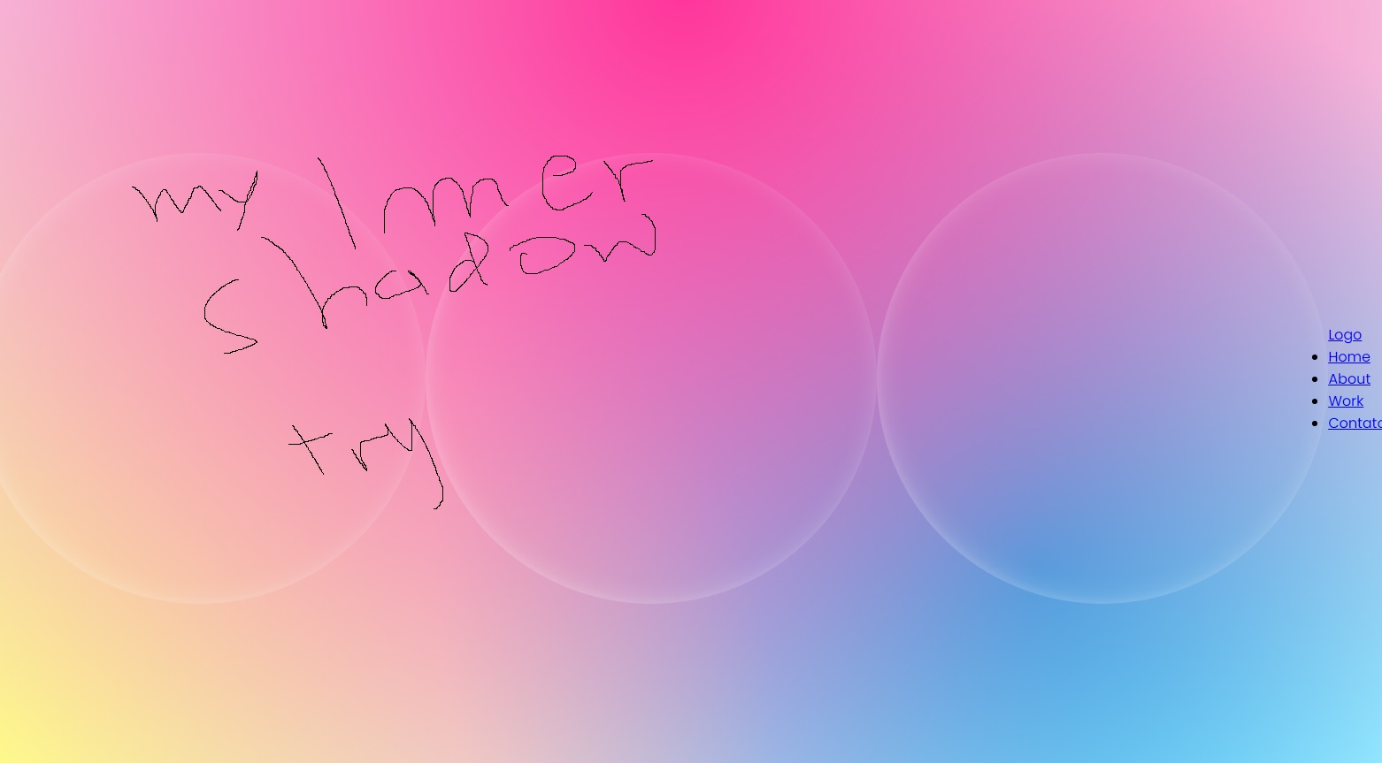
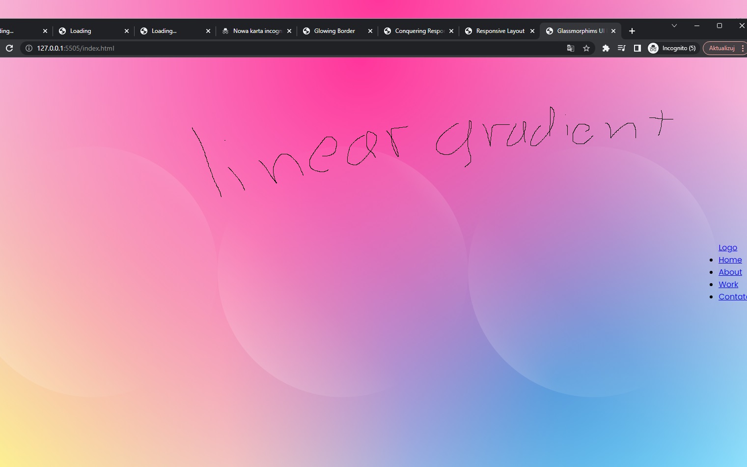
I wonder how to replicate the exact same result as in the original picture I try inner shadow, but when I increase the blur it's spread all around the circle, meanwhile here top-left, and bottom right are clearly transparent, also with linear-gradient is not quite the same

5 Replies
capt_uhu
capt_uhu2y ago
if you're absolutely required to use CSS for this maybe try the box-shadow: inset and a linear or radial gradient mask.
glutonium
glutonium2y ago
box shadow should do the job
JunSu-Ho
JunSu-Ho2y ago
@ʙᴏᴏʙ 2.0 how ? for example
box-shadow:
inset var(--shadow-one) 5px 0 rgba(255, 255, 255, 0.1),
inset var(--shadow-two) 5px 0 rgba(255, 255, 255, 0.1);
--shadow-one: 3px -3px;
--shadow-two: -3px 3px;
box-shadow:
inset var(--shadow-one) 5px 0 rgba(255, 255, 255, 0.1),
inset var(--shadow-two) 5px 0 rgba(255, 255, 255, 0.1);
--shadow-one: 3px -3px;
--shadow-two: -3px 3px;
the result is different
JunSu-Ho
JunSu-Ho2y ago
thanks that's is quite similar
Want results from more Discord servers?
Add your server