Flex box
I'm using two
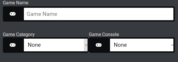
Problem:
-main one is due to using 50% i can not add gap.
-after wrapping they still don't get width:100%; (picture is included)
What do you think I'm doing wrong and could be a better solution.
Codepen:
https://codepen.io/Arslan-Akbar/pen/BaqKzyw
This is what I did in css.
<select></select> <selection></selection>Problem:
-main one is due to using 50% i can not add gap.
-after wrapping they still don't get width:100%; (picture is included)
What do you think I'm doing wrong and could be a better solution.
Codepen:
https://codepen.io/Arslan-Akbar/pen/BaqKzyw
This is what I did in css.
.two_selectors{
    display:flex;
    flex-wrap:wrap;
}
.selector_wrapper{
    min-width:50%;
}


A friendly place for developers to meet other devs, ask questions, get help, and just have a good time 🙂.
36,263Members
Resources
Recent Announcements
Similar Threads
Was this page helpful?