CSS Media Queries
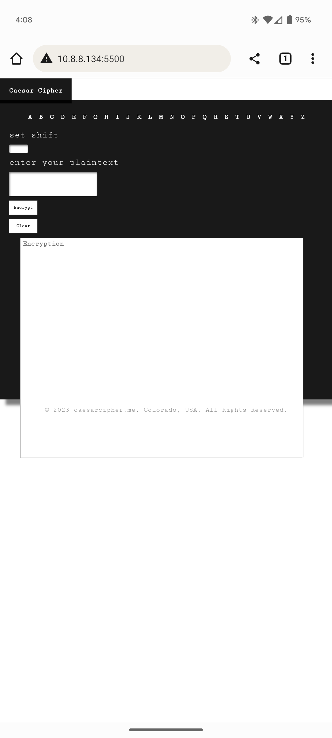
Hello there, I am trying to set up media queries for mobile devices.
For some reason
For some reason
height: 100vh;height: 100vh;@media all and (max-width: 36.25rem) {
body {
width: 100vh;
height: 100vh;
grid-template-columns: 1fr;
grid-template-rows: 6vh 90vh 4vh;
grid-template-areas:
"header"
"main"
"footer";
gap: 0.5rem;
}
header {
height: 6vh;
}
main {
height: 90vh;
grid-template-columns: 1fr;
grid-template-rows: 0.1fr 0.5fr 1fr;
grid-template-areas:
"alphaNum-container"
"aside"
"encryption-area-container";
aside {
grid-area: aside;
display: flex;
flex-direction: column;
form {
display: flex;
flex-direction: column;
align-items: flex-start;
gap: 1rem;
label {
font-size: 2rem;
}
input {
width: 6%;
font-size: 1.2rem;
}
textarea {
font-size: 1.5;
}
}
}
.encryption-area-container {
align-items: center;
textarea {
width: 90%;
height: 90%;
font-size: 1.5rem;
}
}
}
footer {
height: 5vh;
p {
padding: 1rem;
color: rgba(0, 0, 0, 0.5);
font-size: 1.5rem;
a:hover {
cursor: pointer;
text-decoration: 1px line-through solid black;
}
}
}
}@media all and (max-width: 36.25rem) {
body {
width: 100vh;
height: 100vh;
grid-template-columns: 1fr;
grid-template-rows: 6vh 90vh 4vh;
grid-template-areas:
"header"
"main"
"footer";
gap: 0.5rem;
}
header {
height: 6vh;
}
main {
height: 90vh;
grid-template-columns: 1fr;
grid-template-rows: 0.1fr 0.5fr 1fr;
grid-template-areas:
"alphaNum-container"
"aside"
"encryption-area-container";
aside {
grid-area: aside;
display: flex;
flex-direction: column;
form {
display: flex;
flex-direction: column;
align-items: flex-start;
gap: 1rem;
label {
font-size: 2rem;
}
input {
width: 6%;
font-size: 1.2rem;
}
textarea {
font-size: 1.5;
}
}
}
.encryption-area-container {
align-items: center;
textarea {
width: 90%;
height: 90%;
font-size: 1.5rem;
}
}
}
footer {
height: 5vh;
p {
padding: 1rem;
color: rgba(0, 0, 0, 0.5);
font-size: 1.5rem;
a:hover {
cursor: pointer;
text-decoration: 1px line-through solid black;
}
}
}
}

A friendly place for developers to meet other devs, ask questions, get help, and just have a good time 🙂.
36,263Members
Resources
Was this page helpful?