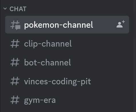
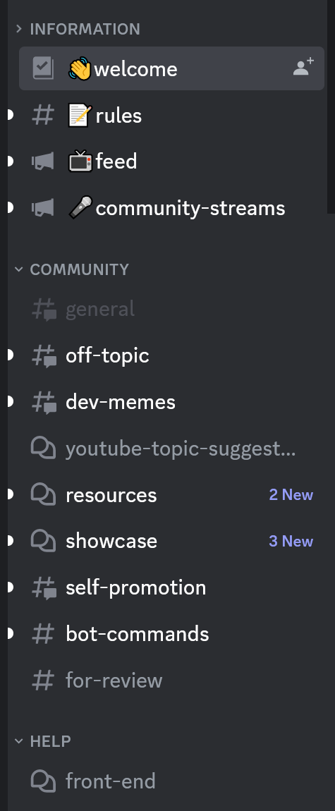
How would you structure this component?

Making a discord clone in html and css for fun, curious what tags you guys would use for this. Discord uses a div for the "Chat"/"Community" button, and then a nav for the individual channels. I think a nav is definitely the right approach, but I feel like there could be a more semantic way to approach the "Chat" button... now that I'm typing this, I just realized I could use aria for this probably... and now that I'm looking it up I can probably use a combination of aria-role and aria-controls. Curious on your inputs, maybe there's a better way I'm missing
1 Reply
vince
vince•2y ago
Ah, so the way discord implements it, to me (a noob), seems really 💩 They have a main nav that holds all of the side channels, and the "Chat/Community" buttons that control each channel section is another li, on the same level as all the other channels that are also li I'm looking into aria-controls and aria-role=tablist/tab not sure if that's the right approach, I'm new to accessibility Hm, after typing this out, not sure if aria-role=tablist and aria-controls is the right approach. Here's what I have currently:
<section aria-label="Chat and voice channels area">
<button aria-controls="channels-nav">Chat</button>
<nav aria-label="Chat channels" aria-expanded="false">
<ul id="channels-nav" role="tablist">
<li role="tab">pokemon-channel</li>
<li role="tab">clip-channel</li>
<ul>
</nav>
</section>
<section aria-label="Chat and voice channels area">
<button aria-controls="channels-nav">Chat</button>
<nav aria-label="Chat channels" aria-expanded="false">
<ul id="channels-nav" role="tablist">
<li role="tab">pokemon-channel</li>
<li role="tab">clip-channel</li>
<ul>
</nav>
</section>
Want results from more Discord servers?
Add your server