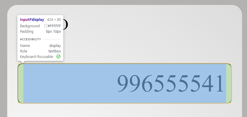
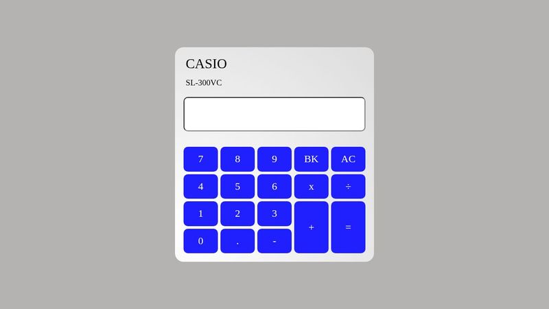
why does this display ID input have padding at top and bottom?
this is the codepen to the project: https://codepen.io/lirem/pen/PoyEVxY
ive tried setting padding on #display to 0 and ive tried setting the input element padding to 0.
the top and bottom padding is only reduced when i increase the font-size. so im guessing that the space is for the content to expand but how can i control it? what funcamental principle of css am I missing over here that is preventing me from debugging this?

