Web app pushes entire content up when virtual keyboard is up

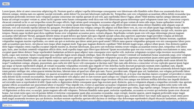
Hi! I have a really easy layout. Header Body Footer This is a chat application. Footer contains a textarea where a user can write, header some menu elem and the body contains the chat messages. When a user clicks on the textarea, the entire page is pushed up so i can't see my header. Here is the codepen link demonstrating the problem: https://codepen.io/drrandom/pen/poxKKNx I have applied a javascript fix which partially works.
var body = document.querySelector("body");
if (window && window.visualViewport){
visualViewport.addEventListener('resize', function(){
let viewHeight = visualViewport.height;
body.style.height = `${viewHeight}px`;
});
}
var body = document.querySelector("body");
if (window && window.visualViewport){
visualViewport.addEventListener('resize', function(){
let viewHeight = visualViewport.height;
body.style.height = `${viewHeight}px`;
});
}
This "fix" will set my body height whenever the viewport changes. This get's the job done, but now i can scroll the part outside of the body tag. And the user can scroll down below the footer. I can't set the position or the overflow since the user is able to scroll the document which i can not reach from neither css or js. I will post a video about the problem. My meta tags:
<meta name="viewport" content="initial-scale=1.0, user-scalable=0, width=device-width, height=device-height"/>
<meta name="apple-mobile-web-app-capable" content="yes" />
<meta name="apple-mobile-web-app-status-bar-style" content="black" />
<meta name="viewport" content="initial-scale=1.0, user-scalable=0, width=device-width, height=device-height"/>
<meta name="apple-mobile-web-app-capable" content="yes" />
<meta name="apple-mobile-web-app-status-bar-style" content="black" />
18 Replies
Dr.Random
Dr.Random•14mo ago
Basic html
<div class="chat-header">
Header
</div>
<div class="chat-body">
<div class="message">Chat message 1</div>
<div class="message">Chat message 2</div>
<div class="message">Chat message 3</div>
</div>
<div class="chat-footer">
<input placeholder="Input here" id="input" />
</div>
<div class="chat-header">
Header
</div>
<div class="chat-body">
<div class="message">Chat message 1</div>
<div class="message">Chat message 2</div>
<div class="message">Chat message 3</div>
</div>
<div class="chat-footer">
<input placeholder="Input here" id="input" />
</div>
Basic CSS
body {
display: flex;
flex-direction: column;
width: 100%;
height: 100svh;
padding: 0px;
margin: 0px;
overflow: hidden;
}

.chat-body {
flex-grow: 1;
overflow: auto;
}

.chat-footer,
.chat-header{
border: 1px solid;
width: 100%;
height: 10%;

display: flex;
justify-content: center;
align-items: center;
}

.message{
width: 90%;
height: 250px;
}
Dr.Random
Dr.Random•14mo ago
b1mind
b1mind•14mo ago
svh is a set value and won't change maybe you want dvh
Dr.Random
Dr.Random•14mo ago
I have tried 100%, dvh,svh,vh on body but i still can scroll if the fix applied If the js fix is not applied, then my header and half of my content goes out of the view
b1mind
b1mind•14mo ago
can you make a minimal demo? oh you did mb
Dr.Random
Dr.Random•14mo ago
yees it is on codepen if i set my header to fixed and don't apply the js fix, it still goes up
b1mind
b1mind•14mo ago
ok but your codepen does not have that stuff xD
Dr.Random
Dr.Random•14mo ago
What stuff
b1mind
b1mind•14mo ago
no reason to have width: 100%; on body either just for future reference. Kevin has a good video about width: auto/100% fixed header, js
Dr.Random
Dr.Random•14mo ago
The codpen demonstrates the problem with the basic layout. If you inspect it in full screen on a mobile device you can see the overflow Js is in the post Yeah, thanks. 😄 I will add this js to the codpen commented out I want that layout which is in discord. If I click on the text area both the footer and the header is visible And I can't scroll below the footer
Dr.Random
Dr.Random•14mo ago
Dr.Random
Dr.Random•14mo ago
well, it seesm that the fix is not working on codepen for some reason.
Chris Bolson
Chris Bolson•14mo ago
Try setting the header to position static when the input gets the focus. I took your codepen, added position:fixed to the header and then created a new class to be added when the keyboard opens (focus on the input). I then just toggled this class via the JavaScript. https://codepen.io/cbolson/pen/OJBwjJK Ah yes, I also increased the input font size to prevent the zoom. Note - I have only tested this on iOS. I know it was just a simplified demo but I have added a few more comments to see if I could get the scroll working I’ve gone and broken it and am running out of battery. I’ll see if I can get it working again tomorrow.
Dr.Random
Dr.Random•14mo ago
Thank you for your kindness. I will check it out! It seems to me that I can't scroll in android. Will check without codepen
Chris Bolson
Chris Bolson•14mo ago
No, it is not working. I am going to take another look at it later one. I’ll let you know if si manage to work it out.
Dr.Random
Dr.Random•14mo ago
Thank you very much. I'm sitting on this two days straight
Chris Bolson
Chris Bolson•14mo ago
I have found this codepen https://codepen.io/codemzy/pen/wvPYEpV. They don't use an input field but the theory is what you are after. I have tested it in my iPhone and it does work. See if it works in your Android and maybe it can help you on your way.
Dr.Random
Dr.Random•14mo ago
Well it does not work on codpen but I will test it locally