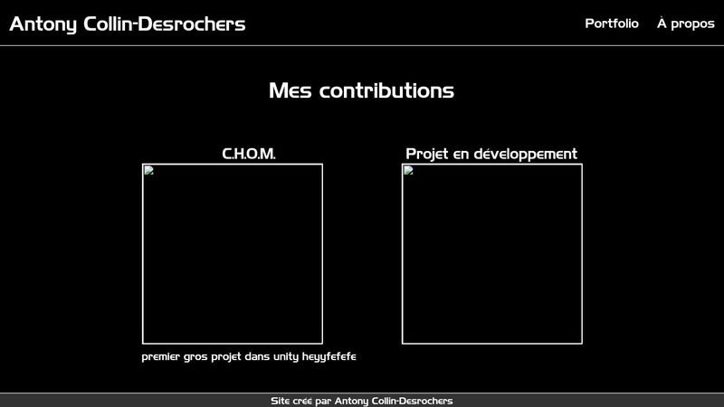
Want text to wrap when larger than parent

https://codepen.io/Antony-Collin/pen/WNYejKZ So I want the text underneath the .game spans to go underneath itself when it's larger than the container. I guess I need to have a fixed width to it's parent, but I don't want to hardcode a fixed width, is there another solution ?
28 Replies
Mannix
Mannix13mo ago
don't use fixed widths on your img tags also 20rem is not gonna be responsive on mobile screen
ghostmonkey
ghostmonkey13mo ago
I have a lot of questions about your code. Why are you span-ing everything? Why are you creating individual classes for each text element, rather than using H1, H2, P, etc? Why do you have media queries with nothing in them? My suggestion to fix this specific question, would be to create individual cards for each game. So instead fo a span, create a 'game' div, and then inside that add a game-title div, game-image div, and game-description div. Then the text will only be as wide as the main card div allows once you have one card setup and you like it, then create a grid of all the cards for each game and pretty much, anywhere you have 'span', I would just delete it or replace it with the correct tag like div, p, h1 etc
Unknown User
Unknown User13mo ago
Message Not Public
Sign In & Join Server To View
QuEEb
QuEEb13mo ago
Why is span not good
Jochem
Jochem13mo ago
span is the option you use when there's nothing with an actual meaning
QuEEb
QuEEb13mo ago
What alternative can I use ?? Thank you
Jochem
Jochem13mo ago
there's nothing wrong with span, but if you take a span and add display: block, you really should have used a div. If you're using a span to represent a paragraph, you should've used p, or h1 for a heading the more you give the browser (and especially assistive technology) a hint at what various bits of your site are, the better, and span is just a wrapper element with explicitly no semantic meaning
QuEEb
QuEEb13mo ago
Thanks
Mannix
Mannix13mo ago
why did you declare that fixed width on the img tags in the first place? what was your goal with that?
QuEEb
QuEEb13mo ago
I wanted to have not a lot of .game for each row and I also wanted the.game-img to all be the same size even when they have different aspect ratio, I don't know how to do otherwise 🥺 frankly, I'm having a hard time with widths, I want as much as possible to not have fixed ones but sometimes it seems like the only possibility
vince
vince13mo ago
I never used fixed widths You're doing something wrong It's okay if you're using max-widths or min-widths, but you need to think really carefully whether you should use width
QuEEb
QuEEb13mo ago
the thing is that when using max/min width I have no idea what values I should use, if I want 3 cards per row I guess the best approach would be to use grid instead of having fixed width for it to wrap ??
vince
vince13mo ago
You can use either flex or grid for that, yea. Grid you can just do something like Grid:
.grid {
display: grid;
grid-template-columns: repeat(3, 1fr);
/* you'll have to set the column size for different screen sizes with this approach though. There's a way to make a grid layout dynamic without media queries: https://css-tricks.com/look-ma-no-media-queries-responsive-layouts-using-css-grid/ */
}
Flex:
.flex {
display: flex;
}

.flex > {
width: 33%; /* Late revision: changed from max-width to width, this is probably one of the few cases where using width would be fine */
/* Can also use flex-basis, but there's a bit of nuance too it. Probably best to just use max-width */
flex-basis: 33%;
}
.flex {
display: flex;
}

.flex > {
width: 33%; /* Late revision: changed from max-width to width, this is probably one of the few cases where using width would be fine */
/* Can also use flex-basis, but there's a bit of nuance too it. Probably best to just use max-width */
flex-basis: 33%;
}
QuEEb
QuEEb13mo ago
so generally instead of having fixed widths, having min/max with percentages values is the best ?
vince
vince13mo ago
In the case of cards yea you can do it like that, though I prefer grid for anything that needs a fixed number of columns on certain screen sizes That's like one of the only times I use %s though I usually use rem for everything, and I know some people like to use em in addition
QuEEb
QuEEb13mo ago
I understand that but when using rem/em for min and max I have no clue what amount I should use, any tips ?
vince
vince13mo ago
I just go with whatever looks nice honestly 😂 I don't think there's really a "right" answer, just go with whatever looks best for your layout and screen size and adjust from there
QuEEb
QuEEb13mo ago
thanks 👍
vince
vince13mo ago
You want your flex and grid containers to be doing all the responsive work pretty much, and changing things up a bit when they break on certain screen sizes. You shouldn't be making a million different media-queries or changing a ton of stuff in every media-query though; that's a good sign you're doing something wrong
QuEEb
QuEEb13mo ago
just one last question, is there a certain width where websites usally change for the layout to be more vertical oriented or people usally change it when it looks nicer in my case, I would like for the cards to take the full width and be vertical on cellphones but I have no idea when to put this media query
vince
vince13mo ago
Kind of a hard question, at least for me, to answer because there's a bit of nuance to it, but imo I usually try to set 3 breakpoints: 1 for mobile, 1 for tablet, and 1 for desktop (you can find common breakpoints for a ton of different devices in either the browsers' devtools or online), and then I match the designs I made in figma for each screen type in my css. There's some nuance to it because there's a lot of different approaches you can take with this. I wouldn't worry about trying to be pixel perfect and get it to look exactly the way you want on every screen size. My approach is like I said: just pick 3 common breakpoints for mobile, tablet, and desktop, and then let grid/flexbox take care of the responsiveness in between if that makes sense. You can also just set breakpoints whenever your layout starts to look a bit off, that's a totally valid approach too. And then there's bigger companies that use adaptive design, and if I recall correctly that's basically where you're designing for a ton of different screen sizes and that's not what you want probably as I think it's probably only viable for bigger companies with teams of people. Most people just stick to responsive design since it's easier and gets the job done
QuEEb
QuEEb13mo ago
I guess I'll have have like 3 breakpoints as you say and try to see what looks nicer on each one. I'll start a figma too I guess that will help because I was just doing it with the flow. I really appreciate your answers, have a nice day.
vince
vince13mo ago
My go-to thing to do now for every project is to make a figma file that shows exactly what I want it to look like on mobile, tablet, and desktop. If I don't do that beforehand it becomes a headache of me trying to figure out mid project what I want the site to look like, and then I start refactoring a lot of my code, so always plan ahead and get a design going in figma that fits the 3 screen types so it makes it much easier for you in the long run
QuEEb
QuEEb13mo ago
I will try just that. Figma also seems like a very common tool that web devs use
vince
vince13mo ago
Yup, the big 3 that I've seen are Figma, Sketch, and Adobe XD. Sketch is I think a monthly subscription, so I would recommend Figma (completely free) or Adobe XD if you have the Adobe Suite. I haven't used much of Adobe XD but from the bit I've used it's really similar to Figma, so you could really use both if you wanted to as well I'd recommend getting really comfortable in one though. It makes prototyping and developing websites much easier Also I changed the code example a bit above from max-width to width, in the comment I said it's probably one of the few cases where using width is fine, max-width probably wouldn't work as well for that particular card layout but you'd have to experiment a bit. Key takeaway is don't use width unless there's a reason to
QuEEb
QuEEb13mo ago
Thank you I guess it will be really easier having a figma so I can test it out without having to code it first
WebMechanic
WebMechanic13mo ago
There's no such thing as exact breakpoints for phone, tablet and desktop. Make the content "break" and "wrap" when it needs to in order to still "look good" If that's 436px and 812px for whatever you design when going from i.e 1 colum (small screens) to 2 column and then eventually 3 or more column for larger screens, so be it. The 480 576 768 1040 screens apply to old Apple devices and virtually any Android device has different screens, incl. new iPhones. So again: change layouts if the content need it not because of some arbitray device width. Tablets are used both in portait and landscape mode and their screen size range is massive, so you basically can't tell unless you also check orientation and viewport height in your media queries. you don't want to design for any fixed pixel values for the reasons I mentined above. Also check out Penpot. They have a great flexbox design tool so you can see content boxes float and wrap.
QuEEb
QuEEb13mo ago
Thanks