Invert text color when elements overlap
Hey guys! I was trying to re-create the "inversion" effect with the cursor and text that I saw here, and it got me thinking a bit: https://drigmatic.com/
This site uses
Is there a way to have more control over blend modes so you can control which color gets displayed when elements overlap? For example, if you wanted to keep the background and the overlapped text colors the same, but have the default text and cursor colors be red, you would end up with some really wonky colors on the cursor and the overlapped text due to the blend modes.
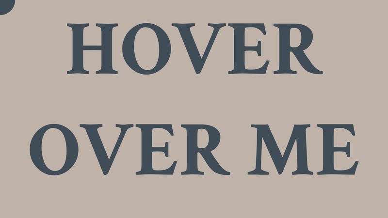
Here's a codepen with a simple recreation of it:
https://codepen.io/Therason/pen/XWydYMv
This site uses
mix-blend-mode: differenceIs there a way to have more control over blend modes so you can control which color gets displayed when elements overlap? For example, if you wanted to keep the background and the overlapped text colors the same, but have the default text and cursor colors be red, you would end up with some really wonky colors on the cursor and the overlapped text due to the blend modes.
Here's a codepen with a simple recreation of it:
https://codepen.io/Therason/pen/XWydYMv
DRIGMATIC - Creative Marketing Agency in Esports and Gaming
DRIGMATIC - Declare yourself to the entire gaming audience! We are a creative marketing agency in the gaming and esports with our own 7,000,000 subscribers in social medias and 10 years of experience. We generate concepts, organize integrated campaigns, hold events, develop visual identity, write scripts, film movies and produce online broadcast...


