text-align vs align-self

Hi 
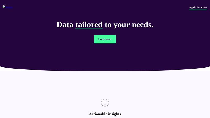
I'm playing arround with flex on the project workit landing page from frontendmentor and tried to center the text from the reason section, within the flex container, but that doesn't seem to work it goes good with the titles, but not with the text..? I have applied text-align on the p and now it is centred, but why is that behavior? my codepen (with notes for make it more clear) https://www.frontendmentor.io/challenges/workit-landing-page-2fYnyle5lu https://codepen.io/joachim-Claessens-the-lessful/pen/OJagbXB
Frontend Mentor
Frontend Mentor | Workit landing page coding challenge
This HTML and CSS-only landing page will be an excellent test of your UI and responsive skills. Thereโ€™s also some fun to be had creating the curved section borders!
7 Replies
Wolle
Wolleโ€ข12mo ago
That is because both work fundamentally different. align-text tells the text inside the element to align (line by line), where as align-self aligns the element itself in its outside context. For example an element that is 100% (height&width) of its parent would not change with align-self. If the text inside does not fit exactly the width of the element its in text-align would affect it. And align-self works only in flex-/grid-containers.
Joachim
Joachimโ€ข12mo ago
Oh okay got it. so text-align is used to center a text line by line (like you can do with word) and align-self does the same but outside the element in the parent container (it divides the empty space left and right so that it is aligned in the center from the container) right? How looks my css code in general? It is the mobile version (work mobile first)
Wolle
Wolleโ€ข12mo ago
You got that right. ๐Ÿ˜Ž Your CSS code looks like ... someones who has not found their style yet ๐Ÿ˜ . Try to find a shema to sort your properties. (in my current project we are sorting them alphabetically; use an autoformatter, if you can, that brings consistency; I know the IntelliJ IDEs can be configured to do so, there is probably a VSC plugin for this, too) You can use empty lines to separate blocks. (no empty lines could mean its one component). You got flex__container directly followin flex__container. Maybe put your utility classes in an extra file? Most of your classes are well named! Try to avoid button__1/2/3 (or flex__container), though. Most style systems use properties like primary, secondary and so on, so you don't end up with .darkmode { --white: #333; }. Now this is just personal preference, but do you need the precision of multiple digits after the dot? As for the design: I like it, its clean with clear hirarchie. On smaller screens I would let the .founder__section toucht the edges (and give it a bit more space on larger). Hope this doesn't discourage you, but instead helps. ๐Ÿ˜ƒ
Joachim
Joachimโ€ข12mo ago
Oh wow, very helpfull your feedback! Much thanks ๐Ÿ˜๐Ÿ˜ Do you know a source for reading more about how to construct my code? ๐Ÿ™‚ But the rulesets that I used are good ?
Shadab๐Ÿ
Shadab๐Ÿโ€ข12mo ago
@joachim did you do the very basic nft card component challenge in frontend mentor. I have a question on that in case you did. Can't show the code here because I can't upload the code from my laptop.
Jochem
Jochemโ€ข12mo ago
please make a post of your own, and you'll have to share the code for people to be able to help. Don't just post in other people's threads because they're talking about front-end mentor
Shadab๐Ÿ
Shadab๐Ÿโ€ข12mo ago
@jochemm sure... Thank you... Will do , if possible