align text and image
Hi all,
I'm currently working on the Workit landing page from frontendmentor, and everything is going well so far. However, I'm facing a bit of a challenge with the section that includes the founder's image and text.
I'm unsure whether applying margins to align them is a good idea (like I did), as it may not be ideal for responsiveness. Ideally, I want it to resemble the design in the Figma file. There should be a box around the image and text, with the box centered on the page. I've tried placing them in a div, but that hasn't solved the issue yet.
Anybody tips? (I know that a few things aren't done yet like the borders, px to rem convert, old comments delete ..) but gonna do that soon as possible, but i want to know first how that I this issue can fix . You can see design on the link from frontendmentor or on the image.
Link project frontendmentor:
https://www.frontendmentor.io/challenges/workit-landing-page-2fYnyle5lu
Link repo:
https://github.com/Thewatcher13/workitt/tree/main/workit-landing-page
Live link:
https://thewatcher13.github.io/workitt/workit-landing-page/
Thanks for your help!
I'm currently working on the Workit landing page from frontendmentor, and everything is going well so far. However, I'm facing a bit of a challenge with the section that includes the founder's image and text.
I'm unsure whether applying margins to align them is a good idea (like I did), as it may not be ideal for responsiveness. Ideally, I want it to resemble the design in the Figma file. There should be a box around the image and text, with the box centered on the page. I've tried placing them in a div, but that hasn't solved the issue yet.
Anybody tips? (I know that a few things aren't done yet like the borders, px to rem convert, old comments delete ..) but gonna do that soon as possible, but i want to know first how that I this issue can fix
 . You can see design on the link from frontendmentor or on the image.
Link project frontendmentor:
https://www.frontendmentor.io/challenges/workit-landing-page-2fYnyle5lu
Link repo:
https://github.com/Thewatcher13/workitt/tree/main/workit-landing-page
Live link:
https://thewatcher13.github.io/workitt/workit-landing-page/
Thanks for your help!

Frontend Mentor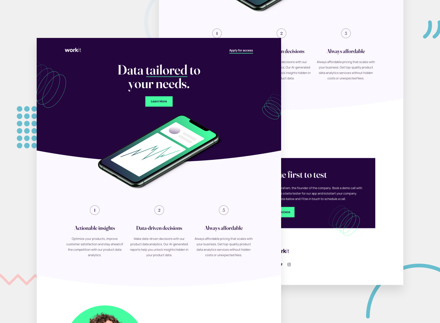
This HTML and CSS-only landing page will be an excellent test of your UI and responsive skills. There’s also some fun to be had creating the curved section borders!

GitHub
Contribute to Thewatcher13/workitt development by creating an account on GitHub.
