Hi everyone!
with and ,and
I'm a beginner (for real) in the front-end world. I'm doing an online course which at the end of each session there's a little project.
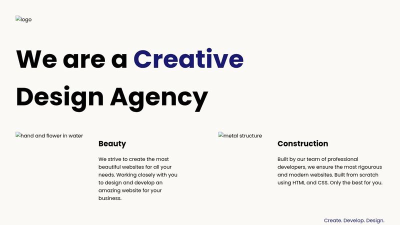
In sum, I can't understand the last project we were supposed to do. I saw the solution video, the solution code and I just can't understand what's happening there. I googled, search for videos on Yt, but honestly I can't understand If someone can please help me understand what's going on with that solution, I would be absolutely grateful.
The HTML code is already provided.
Here are the codes for HTML and CSS: https://codepen.io/msilva96_/pen/eYQPRXG
I'm a beginner (for real) in the front-end world. I'm doing an online course which at the end of each session there's a little project.
In sum, I can't understand the last project we were supposed to do. I saw the solution video, the solution code and I just can't understand what's happening there. I googled, search for videos on Yt, but honestly I can't understand
 If someone can please help me understand what's going on with that solution, I would be absolutely grateful.
 The HTML code is already provided.
Here are the codes for HTML and CSS: https://codepen.io/msilva96_/pen/eYQPRXG

