Please explain how to make a perfect circle

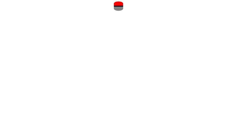
I'm trying to make this a circle but I'm lost on the border radiuses I'll have to use for it, or if there is an even simpler method of doing so https://codepen.io/brightDN/pen/jOQoxpJ
Bright
CodePen
jOQoxpJ
...
20 Replies
Jochem
Jochem15mo ago
it's annoying, but the way I usually do that is by just setting the border radius to something ridiculous like 999px 100% isn't enough
EmmanuelOkonta
EmmanuelOkonta15mo ago
you can use border-radius : 50%
Jochem
Jochem15mo ago
normally yes, if your element is square, but this is three elements trying to make a pokeball
Chris Bolson
Chris Bolson15mo ago
You could set the border-radius :50% on the parent and add overflow:hidden. Then remove the radius that you have set on the two halves.
Jochem
Jochem15mo ago
see, now that is a good solution 😄
Chimi
Chimi15mo ago
I think it's easier and cleaner that way, too
Brightie
Brightie15mo ago
or maybe I can just use one element and just use a linear-gradient? that would do the trick actually
Jochem
Jochem15mo ago
also an option
Brightie
Brightie15mo ago
I have no clue why I wanted to use 3 elements if I can just use one... xd bc they also need to hold a fucntion so I might as well use linear gradient, it'll ease the js code too bc with 3 elements the code for it I already had in place doesn't work propelry Apologies for my spelling Typing too fast Been on a spree of inputting data xd
Jochem
Jochem15mo ago
you could've put the listener on the parent but you're right, a gradient is a cleaner solution
Brightie
Brightie15mo ago
Yeh but, basically here's how it went: I first made all the functions, so I didn't do styling yet, just build the skeleton of the webpage So I made something I could quickly call upon, so I just made a button at first it was just a button, when clicked on a function would run The issue is, with what I replaced it with, it has multiple layers, its just a few lines to the javascript, but I feel like both my html and js would be cleaner if I just use a linear gradient and remain 1 element So basically, my website functionalitywise completely works But looks... Yeh not yet Alright thanks Speaking of clean code... Could um anyone give me tips on how to make my javaScript cleaner? It's a mess
snxxwyy
snxxwyy15mo ago
@.brightie, heres a solution revolving around your original code structure 👍, i didn't put it on codepen just in case i delete the pen in the future, this way you always have it as a reference. HTML
<div class="ball">
<div class="top"></div>
<div class="middle"></div>
<div class="bottom"></div>
</div>
<div class="ball">
<div class="top"></div>
<div class="middle"></div>
<div class="bottom"></div>
</div>
CSS
body {
background-color: #bbdabb;
}

.ball {
margin: 100px auto;
width: 75px;
height: 75px;
display: flex;
flex-direction: column;
border-radius: 50%;
overflow: hidden;
}

.top {
height: inherit;
background-color: red;
}

.middle {
height: inherit;
flex-shrink: 1.6; /*The height is being inherited from the parent meaning the height is 75px, you can set the height to something smaller and take away the flex-shrink and that will give the same result however in my opinion it's a more optimised practice for flexbox to alter the sizes of sections using flex-shrink or flex-grow, but as you can see, there are multiple ways of achieving this.*/
background-color: black;
}

.bottom {
height: inherit;
background-color: white;
}
anyone else is for sure free to improve this for them if you see fit 😄
Brightie
Brightie15mo ago
wait may I have an explanation of why you opted for a flex? is it so you only have to change the height on 1 of the 3 elements or what is the reason? also thank you, tho I think ill stick with the 1div solution with a linear gradient its also way simpler to create via js only needing 3 lines creation , adding of classList, appending the solution w/ the 4 objects would see this js creation multiply in lines needed
snxxwyy
snxxwyy15mo ago
Yeah for sure, it was an easier way to get even sized sections inside without having to play around with height values for all three sections, flex also makes it responsive so if i increase the size of the parent the sizes of the sections inside adjust.
Brightie
Brightie15mo ago
ahh makes sense, didnt think of using flex in such manner yet
snxxwyy
snxxwyy15mo ago
It's all good, maybe it helped you learn a method for the future 👍🏻
Brightie
Brightie15mo ago
it sure has I would've done it element by element
snxxwyy
snxxwyy15mo ago
Ayy good stuff, ah yeah it can be easy to do it like that but responsiveness is key 👍🏻
capt_uhu
capt_uhu15mo ago
so looks like you may have moved to a different approach but border-radius:50% 50% 0 0 / 100% 100% 0 0; would do the trick for your top element and border-radius: 0 0 50% 50% / 0 0 100% 100%; would work for the bottom.
snxxwyy
snxxwyy15mo ago
You can just add a border radius on the parent and hide the overflow rather than having a border radius set for the individual sections 👍🏻
Want results from more Discord servers?
Add your server