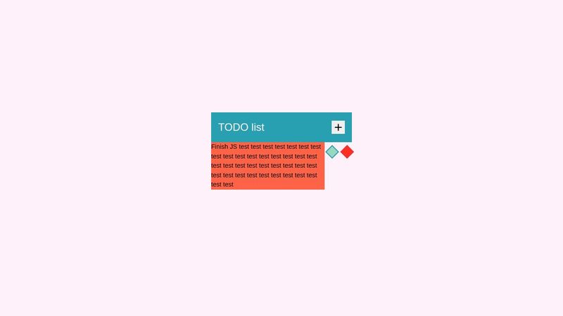
little problem with grid
Codepen: https://codepen.io/rwxganta/pen/bGOBPzd
Hi, ya'll o/
So, I'm doing this TODO list project and I have this Idea where the description break into new lines and goes down in case it's too big.
My problem is that the text starts overflow the parent.
I'm learn grid and have no idea where I did it wrong. Please help 🙂
10 Replies
You don't want to be using a h2.
for one its a semantic element and should only be used in teh correct context (not for its size of font)
That might not be your direct issue though but sticks out to me right away.
What's the end product suppose to look like?
The direct issue honestly is just cause you don't have a space in the llllllllllllllllllllll
Unless you think you are going to have a single word that is that long...
llllllllllllllllllllllllllllllllllllllllllllllllllllllllllllllllllllllllllllllllle
that is going to prevent the word break as its just one long wordI zoomed in ofc
omg I so dummy. kkkkkkkkkkkk I never really try putting real text on it. The trash test did me wrong.
Happens to the best of us xD
Thank you guys and i'm sorry kkk
no reason to be sorry we all learn 😄
Also, to make it easier to produce the dummy text you can just type lorem + the number of words you want (e.g. type "lorem25", hit enter, and it will give you a 25 word string of dummy text)