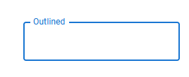
Breaking-border on input fields
Does anybody have any resources for me to look at, or any examples on how to actually do a breaking-border label for a input field? Similar to how material ui's input fields look.
There's a few strategies I know of, which is using clip path (and calculating the width of the label) or using psuedo elements with a background color on the label itself. Both have their own issues, the clip-path strategy is just plain ugly and annoying, and the background color strategy will only work on one background color.
Is there a better way to go about it? Thanks!
5 Replies
https://youtu.be/nJzKi6oIvBA?si=-8nMvh32Qi6nXlun
do you mean something like this?
Tailwind Labs
YouTube
Floating Labels with Tailwind CSS
In this video, you'll learn how to pull off that cool "floating labels" effect using just Tailwind CSS utility classes. We'll use a bunch of new features added in Tailwind CSS v2.2, including the new placeholder-shown variants and the
peer sibling selector variant.
Source code: https://play.tailwindcss.com/cwqORB8ee7
Tailwind CSS v2.2: https:...also for breaking border you could set a background of the bg color with some padding for label to achieve that.
Yeah but that requires me to set a bg-color on the label itself
Which is very annoying to do, as i'd have to pass that as props, or do some weird inherit stuff which will force be to set the parent a bg-color
i don't know the needs and structure of your project. but maybe css variables could help
Hmm, to anyone stumbling across this thread, I have found a different way to handle it,
using
fieldset and legend, and applying the borders to that, instead of the input field itself, this way the legend can break up the border from the fieldset. It seems MUI also works this way