Dynamic amount of columns depending on children size
Hi all,
I have been working on a Frontend Mentor challenge (https://www.frontendmentor.io/challenges/github-user-search-app-Q09YOgaH6) where I encountered a problem.
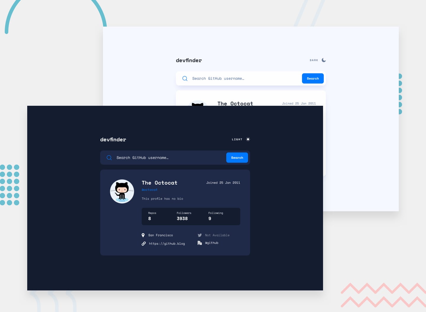
The idea of the challenge is that a user can search for GitHub profiles by name and then display some profile information on the page if the searched username exists. So we have some dynamically entered content, which can have varying lengths.
The issue is with the bottom section of the UI which has a 2 column layout for tablet and desktop and a single column for mobile by design. If you search for a user with a longer website name it can create some overflow at certain screen sizes as you can see in the attached screenshot.
My idea was to create a "flexible" layout for this section since I can't know the size of the content upfront: if there is enough room for 2 columns then render 2, if there isn't enough then stack the content in 1 column. My first plan was to use grid with with auto-fit and max-content. However, as it turns out you can't use auto-fit in combination with intrinsic sizing. So then I tried a few different things with grid and flex, but I couldn't get it working. In the end I used:
But this doesn't allow the content to stack if there isn't enough room, so it can overflow in certain situations.
I was wondering if someone has any idea how to solve this issue?!
I guess in the end there is probably an easy solution but I just can't think of it
I have copied my code into a codepen if anyone wants to have a look:
https://codepen.io/onkelarmin/pen/ExGzyGN
Also, this is the first I am using Discord. So if I did something wrong please let me so I can correct it for future posts/questions.
Cheers,
Armin
I have been working on a Frontend Mentor challenge (https://www.frontendmentor.io/challenges/github-user-search-app-Q09YOgaH6) where I encountered a problem.
The idea of the challenge is that a user can search for GitHub profiles by name and then display some profile information on the page if the searched username exists. So we have some dynamically entered content, which can have varying lengths.
The issue is with the bottom section of the UI which has a 2 column layout for tablet and desktop and a single column for mobile by design. If you search for a user with a longer website name it can create some overflow at certain screen sizes as you can see in the attached screenshot.
My idea was to create a "flexible" layout for this section since I can't know the size of the content upfront: if there is enough room for 2 columns then render 2, if there isn't enough then stack the content in 1 column. My first plan was to use grid with with auto-fit and max-content. However, as it turns out you can't use auto-fit in combination with intrinsic sizing. So then I tried a few different things with grid and flex, but I couldn't get it working. In the end I used:
But this doesn't allow the content to stack if there isn't enough room, so it can overflow in certain situations.
I was wondering if someone has any idea how to solve this issue?!
I guess in the end there is probably an easy solution but I just can't think of it

I have copied my code into a codepen if anyone wants to have a look:
https://codepen.io/onkelarmin/pen/ExGzyGN
Also, this is the first I am using Discord. So if I did something wrong please let me so I can correct it for future posts/questions.
Cheers,
Armin

Frontend Mentor
In this project, you'll use the GitHub users API to pull profile data and display it. It's a great challenge if you're looking to practice working with a 3rd-party API.


