Conform container size to centered grid content
Hello! In this Codepen I have a grid of items that uses auto-fit to keep them centered within a container (using
margin-inline: auto
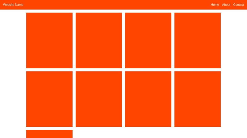
). I also have a navbar using that same container class. Is there a way that I can keep the width of the navbar consistent with the main content as the page resizes? I've attached a mock-up image of the desired effect - note how the edge of each container matches.3 Replies
The problem with
justify-content: space-between
, by the way, is that it creates very large gaps between each item (particularly bad when the screen is small enough to only have two items. I would like those to be centered insteaddo your grid items have to be exactly 240px wide?
you could use
grid-template-columns: repeat(auto-fit, minmax(240px, 1fr))
; and remove the width form the .item.
then they will grow until the container is filledI think that might be the best choice - the issue in the real site is that they are images, and I have been trying to keep them at a low size just to keep file sizes down, but they look okay scaled up a bit too