[How To?] App Router : Whats the most efficient way to structure this layout?

https://www.loom.com/share/9ad8ca7984344870982bbc17cf76b878?sid=9bcca7c0-a71c-49fa-9f0d-bb1b9133c8d7 I am trying to find the most efficient way to structure this type of layout: My folder structure currently looks like:
-app
-layout.tsx **Root Layout**
-(frontend)
-page.tsx **Index Page**
-layout.tsx **Frontend Layout**
-(admin)
-dashboard
-page.tsx
-layout.tsx **Backend Layout**
-app
-layout.tsx **Root Layout**
-(frontend)
-page.tsx **Index Page**
-layout.tsx **Frontend Layout**
-(admin)
-dashboard
-page.tsx
-layout.tsx **Backend Layout**
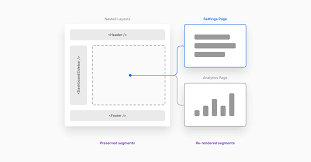
What I am looking for is a Header and sidebar component on frontend and admin pages, however on frontend pages the sidebar should NOT show on desktop, and on admin pages the sidebar SHOULD SHOW on desktop. Then on mobile view, the Sidebar should turn into an off-canvas menu on both the frontend pages and admin pages. This would give a pretty typical experience where the frontend pages, on desktop, have just a header and page content. Then when you log in and go to admin pages, there is a sidebar with admin related link (users, orders, ect). If you access the same flow on mobile, then on the frontend pages there is a reduced mobile header (with just logo and hamburger menu icon) and any header nav items (pricing, about, contact) are moved to the Sidebar. If you sign up and go to admin pages, on mobile, then your admin nav is shown in the Sidebar.
Loom
[How To?] App Router : Whats the most efficient way to structure th...
In this video, I discuss the layout options in the Create T3 app. I explore the difference between the admin and frontend layouts and consider the most efficient way to handle state and sidebar visibility. I demonstrate how the layout changes when viewing the app on different devices. I also share my thoughts on the current implementation and se...
No description
1 Reply
Trader Launchpad
WHAT I HAVE SO FAR: I have something working, but a voice is telling me its not the best way to handle and expand upon this layout design. Looking at the above file structure, in the root layout I insert the Header component and any providers:
return (
<html lang="en">
<body
className={`font-sans ${inter.variable} flex min-h-screen flex-col overflow-hidden`}
>
<Header />
<TRPCReactProvider headers={headers()}>{children}</TRPCReactProvider>
</body>
</html>
);
return (
<html lang="en">
<body
className={`font-sans ${inter.variable} flex min-h-screen flex-col overflow-hidden`}
>
<Header />
<TRPCReactProvider headers={headers()}>{children}</TRPCReactProvider>
</body>
</html>
);
In my app/(frontend)/layout.tsx file I insert the Sidebar with a prop showFixed={false} and a navBar prop where I pass in nav that I want the sidebar to render, which will be conditional based on frontend or admin:
return (
<div className="flex">
<Sidebar showFixed={false} navBar={<FrontendNav/>}/>
<div className="flex-1 p-3">{children}</div>
</div>
);
return (
<div className="flex">
<Sidebar showFixed={false} navBar={<FrontendNav/>}/>
<div className="flex-1 p-3">{children}</div>
</div>
);
In my app/(admin)/layout.tsx file I insert the Sidebar with a prop showFixed={true} and a navBar prop where I pass in nav that I want the sidebar to render, which will be conditional based on frontend or admin:
return (
<div className="flex flex-1">
<Sidebar showFixed={true} navBar={<AdminNav/>} />
<div className="flex-1 p-3">{children}</div>
</div>
);
return (
<div className="flex flex-1">
<Sidebar showFixed={true} navBar={<AdminNav/>} />
<div className="flex-1 p-3">{children}</div>
</div>
);
and then in the Header component I am using zustand to store and retreive state on if the mobile menu button is clicked or not:

const toggleSidebar = useSidebarStore((state) => state.toggleSidebar);
return (
<header className="sticky top-0 z-50 flex min-h-[100px] min-w-0 items-center justify-center space-x-3 overflow-auto bg-slate-400 dark:bg-gray-900">
{isDesktop ? (
<>
<Searchbar />
<UserProfileButton />
</>
) : (
<Button className="md:hidden" onClick={toggleSidebar}>
<MenuIcon />
</Button>
)}
and then finally the Sidebar Component
function Sidebar({
showFixed = false,
navBar,
}: {
showFixed: boolean;
navBar: any;
}) {
const isSidebarActive = useSidebarStore((state) => state.isSidebarActive);
const isDesktop = useBreakpoint("md");
console.log("show", showFixed);

return (
<aside
className={`transform transition-transform ${
showFixed ? "md:block" : "md:hidden"
} ${
isSidebarActive ? "translate-x-0" : "-translate-x-full"
} fixed min-h-full w-64 bg-gray-600 md:static md:translate-x-0`}
>
{isDesktop ? (
""
) : (
<>
<Searchbar />
<UserProfileButton />
</>
)}
{navBar}
</aside>
);
}