Size flexbox items

Hi guys, when i try to size my flexbox items the same size its not really working out. If i add a flex: 1; its looking a bit better but they are still to width and have a different height from eacother. 
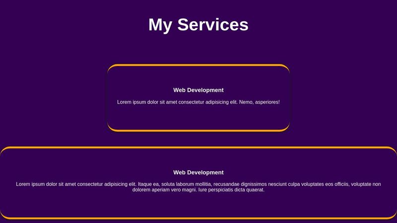
I want them both the same size as picture on in the middle of the page. Whats the best way to eachive this with flexbox https://codepen.io/Boeroe/pen/eYxJaqw
Boeroe
CodePen
eYxJaqw
...
No description
13 Replies
Boeroe
Boeroe•8mo ago
.services { min-height: 100vh; max-width: 60rem; } If i add this on top of the css it got the good sizes but only centered all left so that also not really working
VinceAggrippino
VinceAggrippino•8mo ago
You could use flex: 1 as you've already tried (see the CSS-Tricks Flexbox Guide to understand this better) and just set the height like this:
.services-box {
flex: 1;
height: 15rem;
box-sizing: border-box;
}
.services-box {
flex: 1;
height: 15rem;
box-sizing: border-box;
}
Your .services-box elements have a large padding and borders, so that box-sizing: border-box is really necessary here. If you don't mind using CSS Grid, I think this creates a pretty good layout that doesn't require you to guess as much about how much content you'll have:
.services .services-container {
--spacing: 2rem;
display: grid;
grid-template-columns: repeat(auto-fit, minmax(min(30rem, 100%), 1fr));
place-items: center;
gap: var(--spacing);
padding: var(--spacing);
}

.services-box {
width: 100%;
height: 100%;
max-width: 40rem;
box-sizing: border-box;
}
.services .services-container {
--spacing: 2rem;
display: grid;
grid-template-columns: repeat(auto-fit, minmax(min(30rem, 100%), 1fr));
place-items: center;
gap: var(--spacing);
padding: var(--spacing);
}

.services-box {
width: 100%;
height: 100%;
max-width: 40rem;
box-sizing: border-box;
}
Demo at CodePen: https://codepen.io/VAggrippino/pen/VwgawLP That took some trial and error. I'm not sure I could do a good job of explaining it, but here are some of my references: - https://css-tricks.com/snippets/css/complete-guide-grid/ - https://css-tricks.com/books/greatest-css-tricks/flexible-grids/
Chris House
CSS-Tricks
A Complete Guide to CSS Grid | CSS-Tricks
Our comprehensive guide to CSS grid, focusing on all the settings both for the grid parent container and the grid child elements.
Chris Coyier
CSS-Tricks
Flexible Grids - CSS-Tricks
Perhaps the greatest trick in all of CSS grid is being able to write a column layout that doesn't explicitly declare the number of rows or columns, but automatically creates them based on somewhat loose instructions and the content you provide.
Chris Coyier
CSS-Tricks
A Complete Guide to Flexbox | CSS-Tricks
Our comprehensive guide to CSS flexbox layout. This complete guide explains everything about flexbox, focusing on all the different possible properties for the parent element (the flex container) and the child elements (the flex items). It also includes history, demos, patterns, and a browser support chart.
Boeroe
Boeroe•8mo ago
Thanks Vince, I added a max-width to my services-box in flexbox so its not to touching the left and right border of the page.
Boeroe
Boeroe•8mo ago
Only then when i make my screen small the text is getting out of the box as you can see in the picture
No description
VinceAggrippino
VinceAggrippino•8mo ago
If you set a fixed height on an element then make the screen smaller, of course the content has to go somewhere. This doesn't have anything to do with the max-width. Look at what I did in the last CodePen link. If you make the screen width too small (smaller than 66rem, counting theminmax width and spacing). At any screen size, the boxes never touch the borders and the content never escapes its container unless it gets too small for a single word to fit.
Boeroe
Boeroe•8mo ago
So to understand it, whats wrong with the flexbox code i made so i can resolve this .services-box { flex: 1; height: 15rem; box-sizing: border-box; max-width: 35rem; } .services .services-container { display: flex; justify-content: center; align-items: center; flex-wrap: wrap; gap: 3rem; } .services-container .services-box { padding: 3rem 2rem 4rem; border-radius: 2rem; box-shadow: 0 .1rem .5rem rgb(25, 25, 25); text-align: center; border-top: .4rem solid orange; border-bottom: .4rem solid orange; color: white; } This is it now
VinceAggrippino
VinceAggrippino•8mo ago
Short answer: 15rem. I wouldn't say it's wrong, though. It's just a choice you made. If the height of the box is set at 15rem, and the content is taller than that, of course it's going to go outside of the element. How else could it work? You already told it you want those boxes to be 15rem tall. If you want to use Flexbox and you want the boxes to have the same height I think that's the only way because Flexbox doesn't allow you much control over the size of elements along the cross axis. You could set overflow: auto or overflow: scroll on the boxes, but it looks pretty bad (I tried it). If you want some control both vertically and horizontally, that's when you use CSS Grid. That's why I proposed a solution which uses Grid.
Boeroe
Boeroe•8mo ago
Thank you so much, really learning a lot from your responses. I will use grid for this so i wil have less headache haha. If u make the max-width smallers so the boxes getting smallers the gap between the both divs getting bigger. How can i make the gap smaller. Spacing not really doing much
Boeroe
Boeroe•8mo ago
So they both getting a little bit more to the middle of the page
No description
VinceAggrippino
VinceAggrippino•8mo ago
In the Pen, I used place-items: center, which places the boxes in the center of the grid rectangles. I'll attach an annotated screenshot that should make it easier to understand. If you want all the extra space to be at the sides instead of being evenly distributed, you can remove place-items: center and use justify-items: end. Then, in a new selector for the right-hand-side boxes, use justify-self: start. This breaks the layout if you make the viewport small enough for the boxes to wrap... Now we can use container queries! 🥳 To fix it, set container-type: inline-size on the container and use the size which the boxes start to wrap for the container condition. Inside your @container block, set justify-self: center for all the boxes. In my example, that's 62rem (minimum column width × 2 + 2rem gap... I don't know why the padding doesn't count). I made a second version of my previous demo: https://codepen.io/VAggrippino/pen/zYeBZvK
No description
Boeroe
Boeroe•8mo ago
Not really getting it but it worked, isn't it possible with flexbox on a easy way to understand?
VinceAggrippino
VinceAggrippino•8mo ago
align-items: stretch on a .services .services-container selector might get you closer to what you want using flexbox.
No description
Boeroe
Boeroe•8mo ago
Thank you for all your help
Want results from more Discord servers?
Add your server
More Posts