How to make cut corners borders with a transparent background ?

I followed this great codepen to make cut corners, but is there a way to make the background of the button transparent without destroying the border ? https://codepen.io/kevinpowell/pen/bGLmORx
Kevin
CodePen
Responsive/Adaptive cut corners
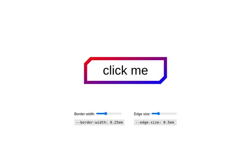
A cut-corner border effect using pseudo-elements. Updating the custom properties lets you change the border (gradient or solid color), background color...
18 Replies
Tok124 (CSS Nerd)
Tok124 (CSS Nerd)β€’7mo ago
You could do it with just a gradient
Tok124 (CSS Nerd)
Tok124 (CSS Nerd)β€’7mo ago
Aah, kevin powell used a clip-path. Yeah that is ofc also a great option But if you want the background to be transparent, you could create a mask
bunlock
bunlockβ€’7mo ago
ok, a mask then maybe, because trying a gradient rn makes the border-color take the whole background of the buton πŸ™‚ I'm scratching my head there, learning masks and makes the content disappear...
Tok124 (CSS Nerd)
Tok124 (CSS Nerd)β€’7mo ago
I think you're going to need to use mask-composite too
Tok124 (CSS Nerd)
Tok124 (CSS Nerd)β€’7mo ago
MDN Web Docs
mask-composite - CSS: Cascading Style Sheets | MDN
The mask-composite CSS property represents a compositing operation used on the current mask layer with the mask layers below it.
Tok124 (CSS Nerd)
Tok124 (CSS Nerd)β€’7mo ago
But i don't fully understand how mask-composite actually works. I have known about this property for a very long time and i have really tried to learn how to actually use it. But yeah this is beyond my experience ^^ Too bad kevin powell have not made a video explaining how it works 😦
bunlock
bunlockβ€’7mo ago
https://codepen.io/bunlock/pen/VwgdEEM => this shows my problem better πŸ™‚ thanks for the hints anyway
Tok124 (CSS Nerd)
Tok124 (CSS Nerd)β€’7mo ago
Yeah, i know, but yeah i think you need a mask and mask-composite. You can do something like mask:linear-gradient(transparent, red, transparent) no-repeat subtract So the subtract in this case is the mask-composite. So you can use it directly inside the mask because mask is a shorthand property
bunlock
bunlockβ€’7mo ago
oh well, atm seems to have no effect, I'll dig into this tomorrow, thanks again for the hints
Tok124 (CSS Nerd)
Tok124 (CSS Nerd)β€’7mo ago
Yeah like i said. I dont really know much about the mask-composite. But you can read the link i posted above and maybe it makes more sense to you.
capt_uhu
capt_uhuβ€’7mo ago
did something like this a while back: https://codepen.io/jsnkuhn/pen/zYeYWWJ
bunlock
bunlockβ€’7mo ago
I think there might have compatibility problems with this.
capt_uhu
capt_uhuβ€’7mo ago
mask and mask-image are indeed a bit of a mess right now. I got it added to Interop 2023 so Chrome and Safari are working on finally getting caught up to Firefox this year. If you use auto-prefixer or copy and paste the code it generates you should be good to go.
bunlock
bunlockβ€’7mo ago
I finally changed the ux to avoid this problem, thanks for your hints people
RealComet
RealCometβ€’7mo ago
I can do it.
Mimo Duo
Mimo Duoβ€’7mo ago
Oh boi what a thread! Just dropping this and bouncing, with clip-path you can create a polygon in the shape of a thick border on one element rather than simply clipping two backgrounds / having two separate elements with clip path that clip only the corners. So imagine plotting points on a square, the last point meets the first but then you plot backwards on the inner part of the circle to the beginning. That'll make a polygon in the shape of a thiiqqq outlined square! But luckily you escaped so goodbye!
capt_uhu
capt_uhuβ€’7mo ago
Unfortunately, There really aren't any straight forward solutions for angled corners in CSS yet. (a spec-ed but not supported property called corner-shape might be the answer in the future). The other option that hasn't been bright up yet is border-image with SVG. Not going to be able to change values like color and width in CSS then though. https://codepen.io/jsnkuhn/pen/eYMQmoe